
Section 10.6 Student Debt by College Type
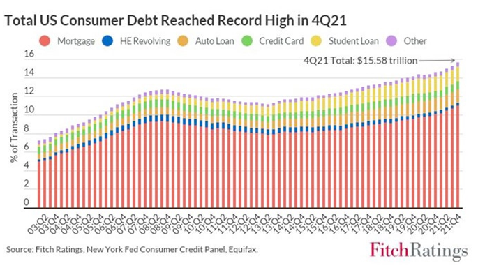
Use the graph in Figure 10.6.1 to estimate:
The percentage of total debt in 2008 that was student loans vs. mortgage debt.
The percentage of total debt in 2021 that was student loans vs. mortgage debt.
Why do you think did this graph choose 2003 as a starting year?
Do research online if needed to determine why the second quarter of \(2008\) was the previous peak in U.S. total consumer debt.
Find another source for the US consumer debt broken down by type of debt in 2008 and in 2019. Does it agree with the graph above? Why or why not?
-
Use the Excel spreadsheet on undergrad and grad tuition/fees from the National Center for Education Statistics 1 (make a copy first) and/or the Excel version of this table 2 on undergrad tuition by nonprofit status and college private/public status to do the following:
Create a graph, trendline, and interpret the \(R^{2}\) value for each type of institution: public nonprofit, private nonprofit, private for-profit. What does it mean? Use it to predict average tuition and fees across the country in the current year. How accurate is your prediction?
-
Fit the data to a polynomial function (of least degree). We'll talk about how to do this in class, so let me know when you reach this step. For your reference, the steps in Excel are:
Left-click on your graph. In the top menu under Chart Tools , click Design.
Click Add Chart Element -> Trendline -> More trendline options. Click on the data you want to make a trendline for.
In the right sidebar, select Polynomial and play around with the Order until you get a good fit for your data.
Check Display Equation on chart and Display R-squared value on chart.
Now, our goal is to get all our \(R^{2}\) values larger than roughly 0.96, which is a very large degree of accuracy. If some of your trendlines have \(R^{2}\leq0.96\text{,}\) double-click on the offending trendline(s) until the sidebar comes up and increase the Order of your polynomial until \(R^{2}>0.96\text{.}\)
What trends over time do you notice in each the three graphs? Describe trends in words, using phrases like increasing, decreasing, increasing slope, decreasing slope. What overall trend do we notice that's common to all three graphs over time?
-
The \(R\)-squared value that I asked you to show in Item 6.a above measures what proportion of the variation in the \(y\)-variable is explained by the trendline. For instance, \(R^{2}=1\) means that \(100\%\) of the variation in y is explained by the trendline, so the trendline is a perfect fit. Conversely, \(R^{2}=0\) means that the trendline explains \(0\%\) of the variation in the \(y\) variable, so this trendline doesn't fit the data at all.
What percentage of the variation in two-year public college tuition (\(y\)) is explained by the variation in year (\(x\))? What about when \(y=\) four-year private college tuition? Four-year public college tuition?
Outliers are data that fall far away from the trendline. What outliers do you notice, if any? Interpret these outliers in context: what do they mean for tuition and fees over time, and what possible historical explanations could there be for these outliers?
-
Polynomials are a special type of mathematical function, or process for turning one number into another. Polynomials are functions of the form \(f(x)=a_{n}x^{n}+a_{n-1}x^{n-1}+\dots+a_{1}x^{1}+a_{0}\text{:}\) sums of powers of \(x\text{,}\) maybe with constant terms in front. For example, \(f(x)=x+1\text{,}\) \(g(x)=17x^{3}-234x+7\text{,}\) and \(h(x)=-x^{1}42+1\) are all polynomials. The polynomial \(a(x)=x^{2}+2x+3\) takes the input 1 and turns it into the output \(1^{2}+2(1)+3=6\text{.}\) All numbers which make sense to input are called the domain of the function, and the possible sensical outputs you could get are called the range.
What is the domain and range of each of the polynomial trendlines?
Use this model to predict the tuition cost for a student entering each type of institution in the academic year \(2020\)-\(2021\text{.}\) How accurate do you think your prediction is?
Use the model to predict the tuition cost for a student entering a public two-year college in the academic years \(2050\)-\(2051\text{,}\) \(2100\)-\(2101\text{,}\) and \(1900\)-\(1901\text{.}\) How accurate do you think your predictions are?
Within (roughly) what domain do you think your trendline can make fairly accurate predictions? Explain.
Does this table (and the supplement 3 on the number of students in grad school) back up the suggestion of this Atlantic article 4 [10.11.179] that the cause of increased student debt is that more students are taking out loans to enroll in grad school? Why or why not?
Use TuitionTracker 5 to describe recent trends at your own institution in the same way. Is your college or university better or worse in amount of student debt than the average in the US? The average for institutions of the same type?
-
Compare the total amount paid in student debt for various racial groups using this table 6 .
Does it seem like any racial groups are being disproportionately saddled with student loan debt? How can we compare, say, debt held by white vs. Asian students to see whether the difference is larger than we'd expect? Well, first we need to quantify the idea of what we'd expect ...what does this mean? Create an expected frequency table for what you'd expect to see if there were absolutely no racial differences in student debt.
Compute the difference between the observed count for each race \(O\) and the expected count \(E\text{.}\) What do you notice?
What if we averaged all the \(O-E\)\textquoteright s for each racial group? This is effectively the idea of a chi-squared test for goodness-of-fit, which is used by statisticians to determine whether any differences observed are small enough to be due to chance or large enough that they give evidence of a difference. What would the equation for this average look like?
We'll use a computer to perform this test in a minute. First, what groups do you think are disproportionately likely/unlikely to hold student loan debt? What racial groups have a higher/lower debt burden per person?
Now, enter this data into an app such as RStudio or an online tool. In RStudio, run this code to do a chi-squared test. (In a statistics class, walk through the steps.) Output the \(p\)-value (the likelihood the observed differences are due to chance alone) and \textbf{residuals}, which are basically scaled versions of the \(O-E\) s for each racial group. Which are highest? Lowest? Is there evidence of racial bias?
If these materials are being used for a course in, say, introductory statistics for STEM fields or a higher-level data science class, this is a good time to discuss linear regression with multiple predictors 7 to formalize the effect of year and type of institution on tuition or race and year on student debt. However, since this text is primarily intended for courses without prerequisites targeted at majors and non-majors alike, such material is beyond the scope of this chapter.
docs.google.com/spreadsheets/d/1lbB5OSSsxrwQdDh5Px8fqMSRRwwvxseg/edit?usp=sharing&ouid=113361107850751941418&rtpof=true&sd=true/copystudent-loans/data-files/nces-tuition.xlsxnces.ed.gov/programs/coe/indicator/chb/postbaccalaureate-enrollmentwebcache.googleusercontent.com/search?q=cache:QCadmloDEIoJ:https://www.theatlantic.com/ideas/archive/2022/04/should-biden-forgive-student-loan-debt/629700/&cd=18&hl=en&ct=clnk&gl=uswww.tuitiontracker.org/school.html?unitid=230807nces.ed.gov/fastfacts/display.asp?id=900openintro-ims.netlify.app/model-mlr.html