
Section 5.6 Data Visualization
Any organized collection of information used to understand or solve a problem is called data. When you think of data, you may think of a long list of numbers which represent a measurement. However, this isn't generally the most useful way to look at a set of data. When we look at data, we use data visualizations to help us understand the data more quickly and efficiently. You're probably familiar with at least one type of data visualization, the graph, but we'll explore some more of the variety of ways in which people look at data in this module.
Subsection 5.6.1 Types of Data
To understand data visualization, we first need to understand a bit about the way mathematicians talk about different kinds of data. Mathematicians broadly divide data into two types:
Definition 5.6.1. Qualitative (Categorical) Data.
Data which is not numerical is called qualitative (or categorical) data. Qualitative data can include things like names, categories of objects or people (which is where the other name, categorical, comes from), or different things which are being compared.
Definition 5.6.2. Quantitative Data.
Data which can be represented numerically is called quantitative data. This includes both data which is already numerical, and data which can be made numerical. Dates are a good example of quantitative data that isn't always written in numbers (for example, "March" doesn't seem numerical, but can be represented by 3 since it is the 3rd month of the year).
Quantitative data naturally falls into one of two types - discrete and continuous. While there are more complicated ways to distinguish between them mathematically, for our purpose the big difference is that with quantitative discrete data we have a small number of distinct possible responses, while with quantitative continuous data we have a large number of different possible responses.
It is important to be able to distinguish between quantitative discrete and quantitative continous data, because we visualize them in different ways. Quantitative discrete data is characterized by:
Small number of different values.
Many values are repeated.
Often (but not always) quantitative discrete data is counts of objects.
Quantitative continuous data is characterized by:
Many different values.
Most data values are distinct or only occur a few times.
Often (but not always) quantitative continuous data are measurements.
Let's look at some data and decide whether it's qualitative, qunatitative discrete, or quantitative continuous.
Checkpoint 5.6.4.
A survey asks people how many cars they own.
Hint.Checkpoint 5.6.5.
A researcher collects a list of the companies which emit the most methane into the atmosphere.
Hint.Checkpoint 5.6.6.
A scientist measures the amount of ozone in parts per million in the atmosphere at a particular location every day for a year. Note: here the scientist is collecting two different (connected) pieces of data - the measurement of ozone and the day on which they collected it.
Hint.Subsection 5.6.2 Graphs
Small amounts of data can be represented through things like lists and tables, but more complicated data is easier to understand through a visual representation. Visual representations of data allow us to see patterns and trends in the data that would be much harder to detect in a simple list or table.
The most common types of visual representation of data are called graphs or charts. While you're probably familiar with many types of graphs, we'll be introducing some that you may not be familiar with, and focusing on how and when to use the different types. There are many different types of graphs, because each one is used to display different types of information and highlight different aspects of that information. In the following subsubsections, we'll go through each of the types of graphs
Subsubsection 5.6.2.1 Bar Graphs
A bar graph is a graph which represents data as bars of various heights. A bar graph can be used in several different ways.
The first way that a bar graph can be used is to display a single set of qualitative or quantitative discrete data. This is done by taking a data set and translating it into a frequency table.
Definition 5.6.7. Frequency Table.
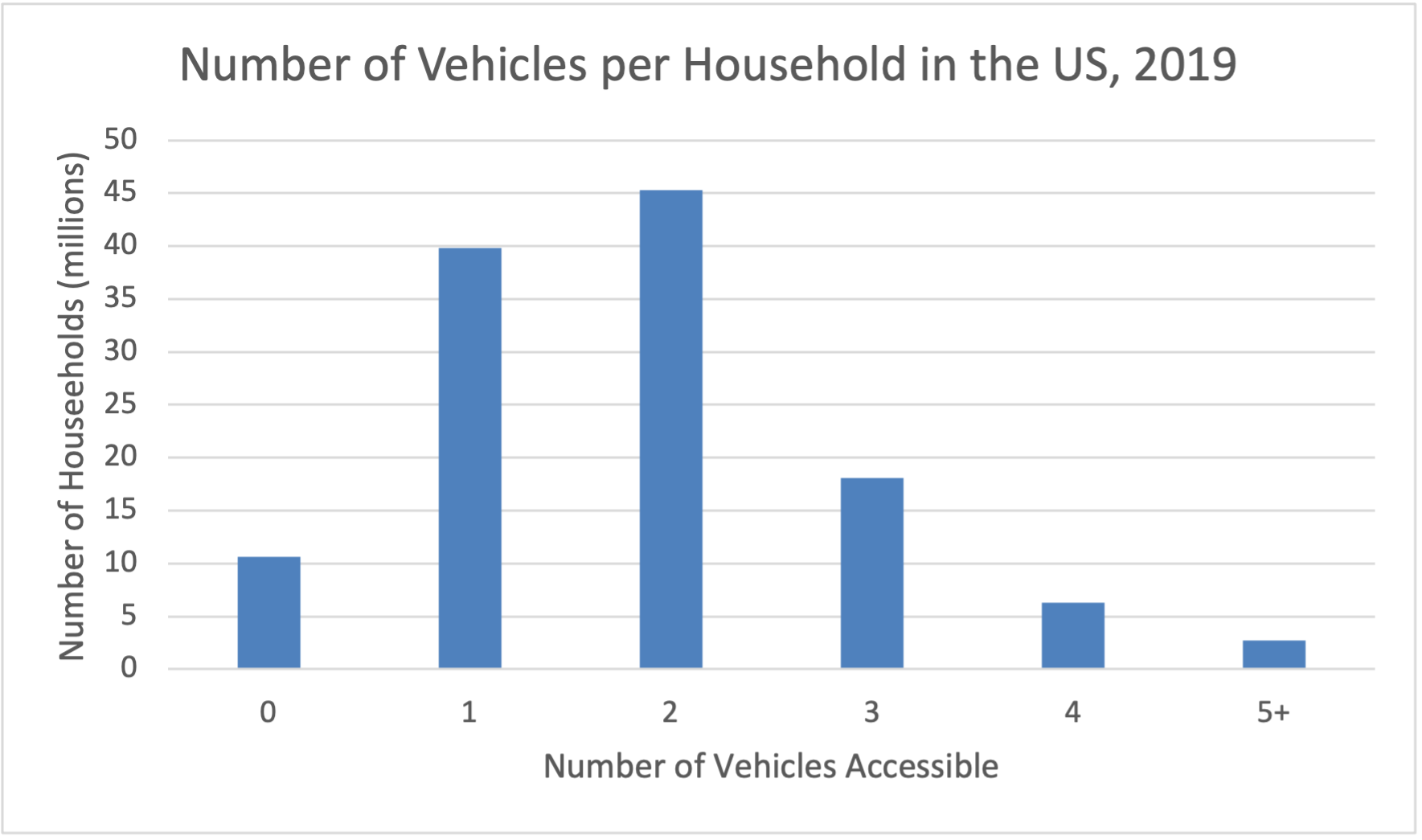
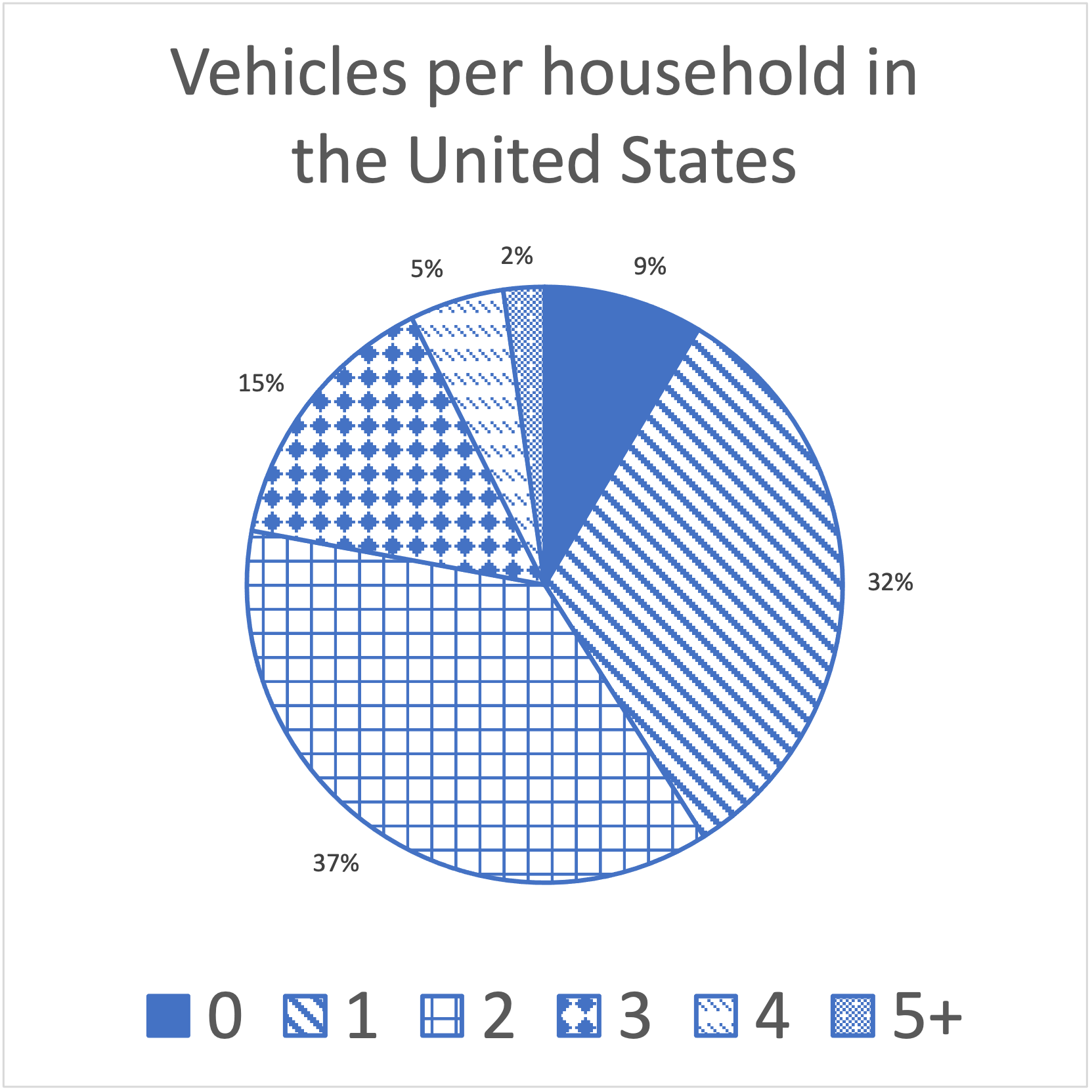
A frequency table lists each of the distinct values in a data set followed by the frequency of that value - the number of times that it appears in the data set.An example of a frequency table, which displays a quantitative discrete data set is given below. The American Community Survey, part of the US Census, asks Americans how many vehicles their household has access to (either owned or shared). The number of vehicles is quantitative discrete because most households in the USA have access to 0, 1, 2, or 3 cars. The data from 2019 is shown in the table [5.11.1.52]:
| Number of Vehicles Available | Millions of Households |
|---|---|
| 0 | 10.6 |
| 1 | 39.8 |
| 2 | 45.3 |
| 3 | 18.1 |
| 4 | 6.3 |
| 5+ | 2.7 |
This data can be turned into a bar graph which uses the frequency (the number of households in millions that gave a particular response) as the height of the bars.
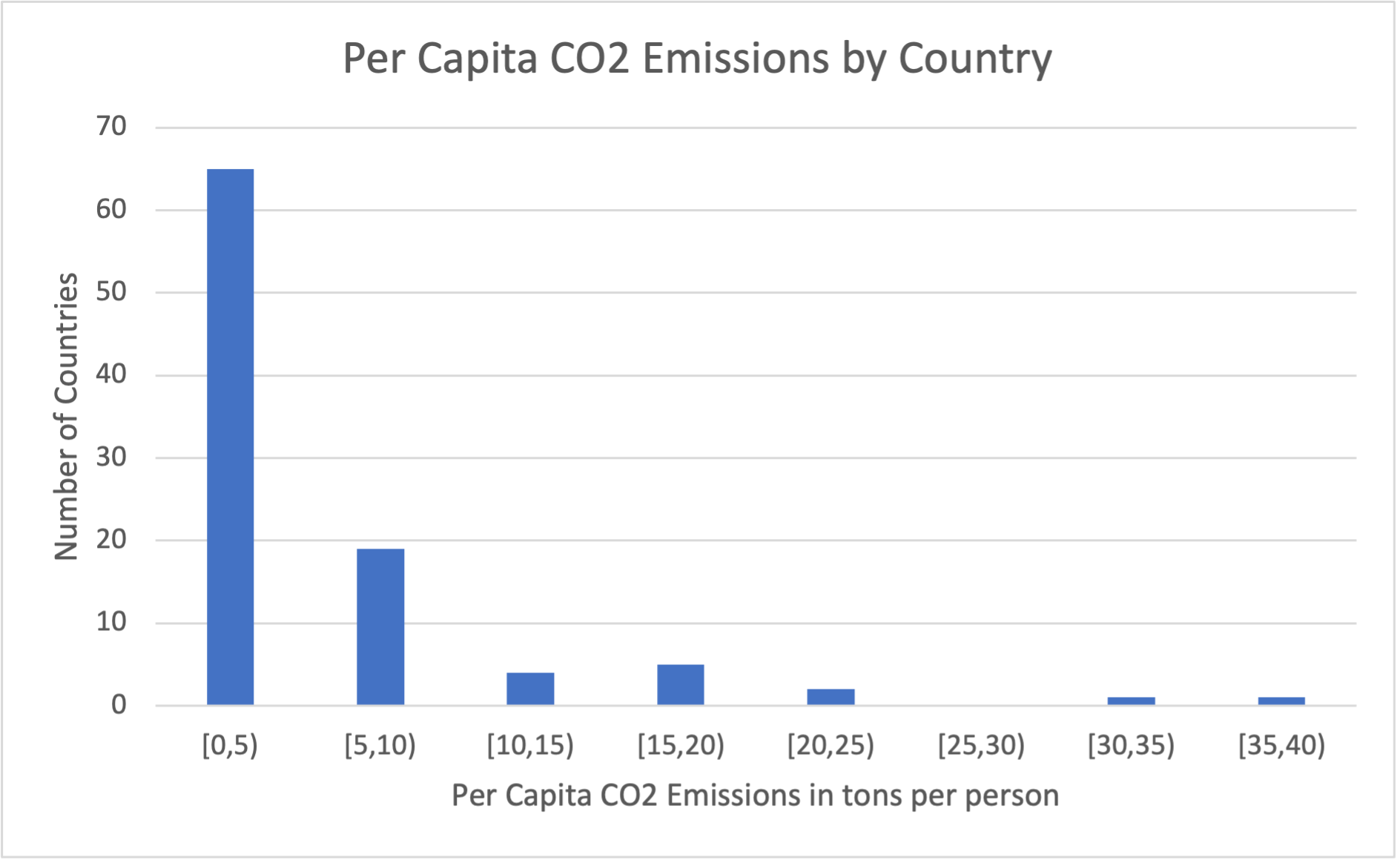
If your data set is quantitative continuous, you can still create a frequency table, but you need to sort the data into ranges. If you don't, most of your data values will have very low frequencies, and you'll have a ton of different values to graph. A bar graph which displays quantitative continuous data with that data sorted into ranges is called a histogram.
The data below represents the per capita emissions, in tons of CO2 per person, of 97 nations across the world. You can see from the data that if we look at the frequency of each value, almost all of them have frequency 1 (a handful, like 0.09 and 0.13, have frequency 2). Creating a bar graph of these values wouldn't be very useful, but if we sort them into categories - 0 to 5, 5 to 10, etc. - we can see more patterns in the data.
0.02, 0.04, 0.07, 0.09, 0.09, 0.13, 0.13, 0.23, 0.25, 0.26, 0.29, 0.32, 0.36, 0.38, 0.52, 0.55, 0.56, 0.6, 0.67, 0.85, 0.86, 0.99, 1.01, 1.05, 1.09, 1.1, 1.11, 1.13, 1.23, 1.46, 1.52, 1.59, 1.68, 1.69, 1.74, 1.76, 1.92, 1.94, 1.95, 2, 2.19, 2.3, 2.37, 2.38, 2.45, 2.48, 2.5, 2.52, 2.56, 2.66, 2.72, 2.75, 3.38, 3.48, 3.58, 3.66, 3.79, 4.02, 4.08, 4.17, 4.21, 4.53, 4.64, 4.66, 4.83, 5.18, 5.67, 5.67, 5.76, 5.81, 5.94, 6.2, 7.08, 7.2, 7.46, 7.64, 7.67, 7.87, 8.31, 8.41, 8.76, 9, 9.07, 9.85, 12.76, 12.96, 14.49, 14.82, 15.25, 16.44, 17.69, 18.82, 19.31, 21.12, 23.47, 31.45, 36.46
Notice that in making our categories, we're careful to not let them overlap - we don't want to accidentally count a value, like 10, that is on the edge in two categories. We also want to make sure that we don't have too many different categories. While you can make a histogram with as many categories as you like, it's generally best to keep the number of categories small, so that there are a lot of data elements in most of them. If you use too many categories, then you will be back in the situation where almost every column contains just one or two elements.
| Per Capita Emissions | Number of Countries |
|---|---|
| [0,5) | 65 |
| [5,10) | 19 |
| [10,15) | 4 |
| [15,20) | 5 |
| [20,25) | 2 |
| [25,30) | 0 |
| [30,35) | 1 |
| [35,40) | 1 |
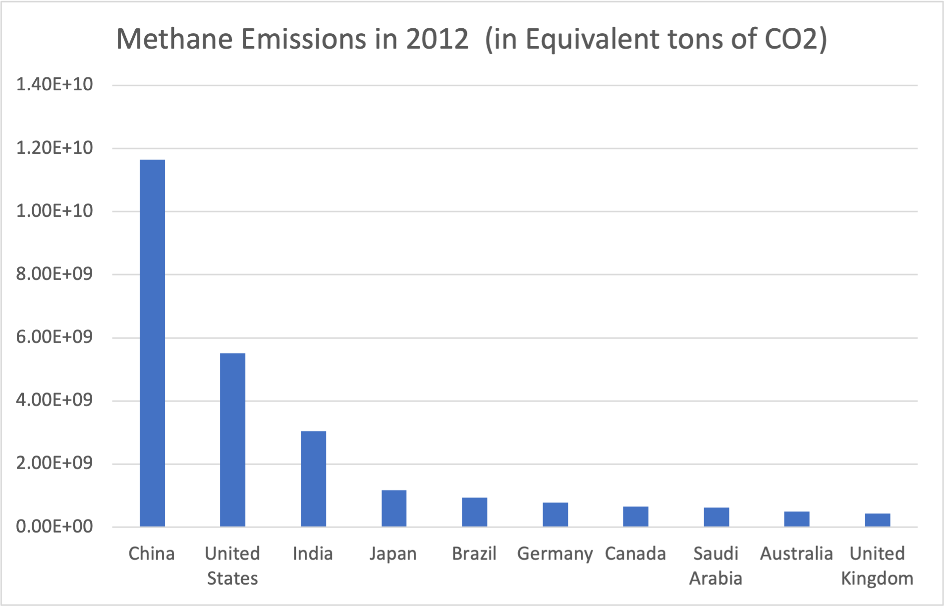
A bar graph can also be used to display a correspondence between two different types of data, as long as one of them is quantitative. The quantitative data will be used for the height of the bar. For example, the table below shows the amount of methane produced by the ten countries which produce the most greenhouse gases, in equivalent tons of carbon dioxide. The country names are qualitative data, and each country has a corresponding quantitative continuous value which represents the amount of methane they produce. This data is taken from [5.11.1.51].
| Country | Total Methane Emissions in Equivalent Tons of CO2 |
|---|---|
| China | 1.17E+10 |
| United States | 5.51E+09 |
| India | 3.04E+09 |
| Japan | 1.17E+09 |
| Brazil | 9.39E+08 |
| Germany | 7.84E+08 |
| Canada | 6.52E+08 |
| Saudi Arabia | 6.26E+08 |
| Australia | 5.02E+08 |
| United Kingdom | 4.38E+08 |
You can create a bar graph for this data by creating a bar for each country, and using the amount of methane as the height of the bar.
To summarize, bar graphs are generally used to display a single set of data or to show a correspondence between two data sets. They are one of the most versatile and flexible forms of data visualization, and can be used in a variety of contexts. Unless there is a good reason to choose another type of graph, a bar graph is usually the best way to take a first look at a set of data.
Subsubsection 5.6.2.2 Pie Charts
A pie chart is a specialized type of graph which is used to display a single set of data. It is usually used when there are a small number of different data values (less than 10), but can be used effectively with more. In a pie chart, a circle is divided into wedges, with each wedge corresponding to a different data value or group of data values. The size of the wedge is determined by the percentage of the data which matches that data value or group of values.
To create a pie chart, you should first create a frequency table. However, unlike a bar graph, to create a pie chart you need to know the relative frequency.
Definition 5.6.14. Relative Frequency.
The relative frequency of a data value is the percentage of overall values which match that data value. It can be calculated by taking the frequency and dividing it by the total number of data values.Let's add relative frequency to Table 5.6.8. First, we calculate the total number of data values, by adding up all the frequencies. There are 122.8 million households total in this data set. To find the relative frequency, we just take each frequency and divide by 122.8. For example, because 10.57 million households do not have access to a car at all, the relative frequency of the data value 0 is
We repeat this for each value to fill in the rest of the frequency table.
| Number of Vehicles Available | Millions of Households | Percentage of Households |
|---|---|---|
| 0 | 10.57 | 9% |
| 1 | 39.82 | 32% |
| 2 | 45.29 | 37% |
| 3 | 18.09 | 15% |
| 4 | 6.30 | 5% |
| 5+ | 2.74 | 2% |
| Total | 122.80 |
Once we have a frequency table with relative frequency, we can create a pie chart. To create a pie chart, divide the circle into wedges, where each wedge takes up some percentage of the total circle. Those percentages should match the relative frequencies in your frequency table. Making a pie chart by hand can be tricky, because you need to estimate what different percentages of the circle would be.
For quantitative continuous data, your wedges of the pie chart will correspond to ranges of values instead of individual values. For example, here is the data from Table 5.6.10, with relative frequencies:
| Per Capita Emissions | Number of Countries | Relative Frequency |
|---|---|---|
| [0,5) | 65 | 67% |
| [5,10) | 19 | 20% |
| [10,15) | 4 | 4% |
| [15,20) | 5 | 5% |
| [20,25) | 2 | 2% |
| [25,30) | 0 | 0% |
| [30,35) | 1 | 1% |
| [35,40) | 1 | 1% |
| Total | 97 |
When we create a pie chart from this data, we get the following image
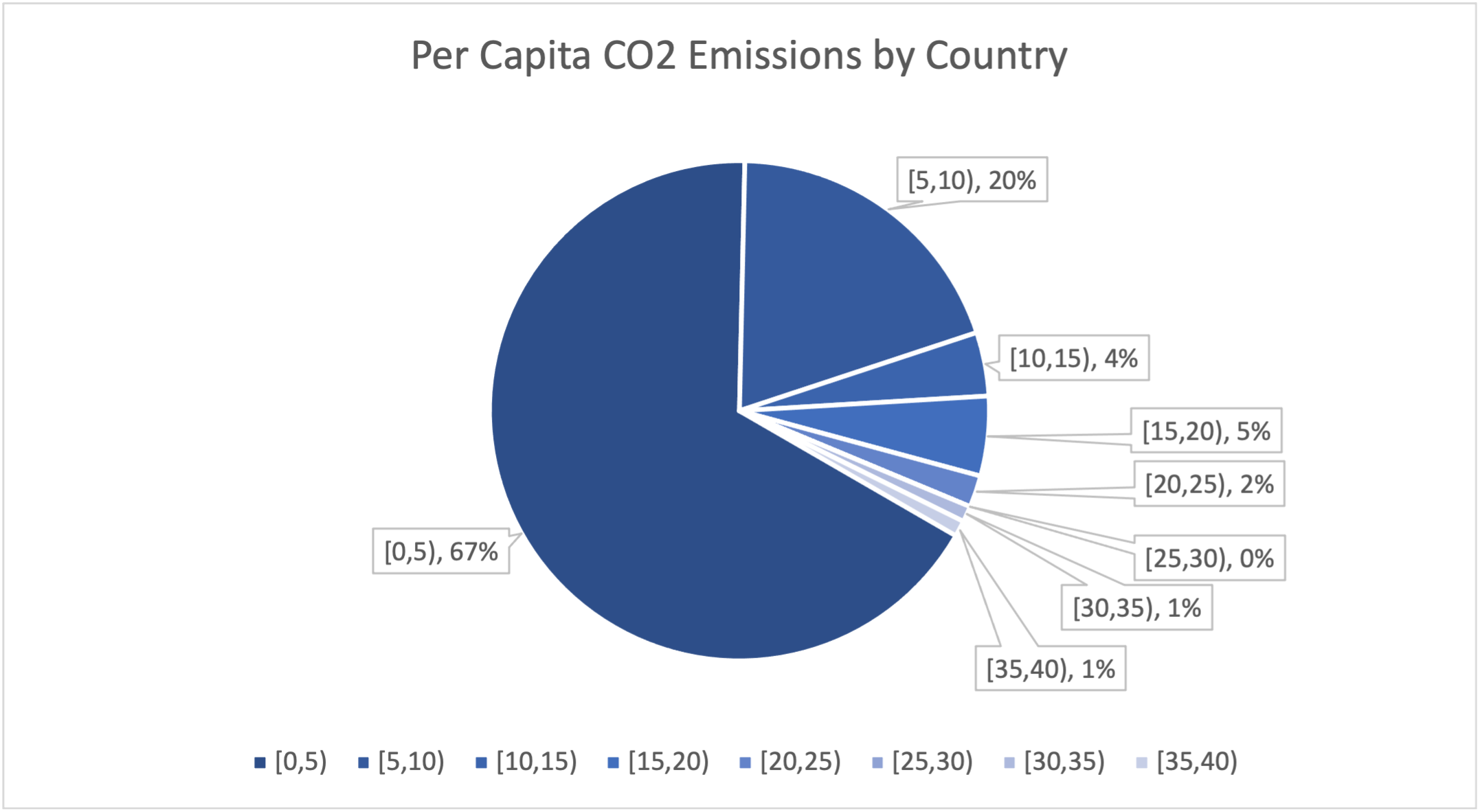
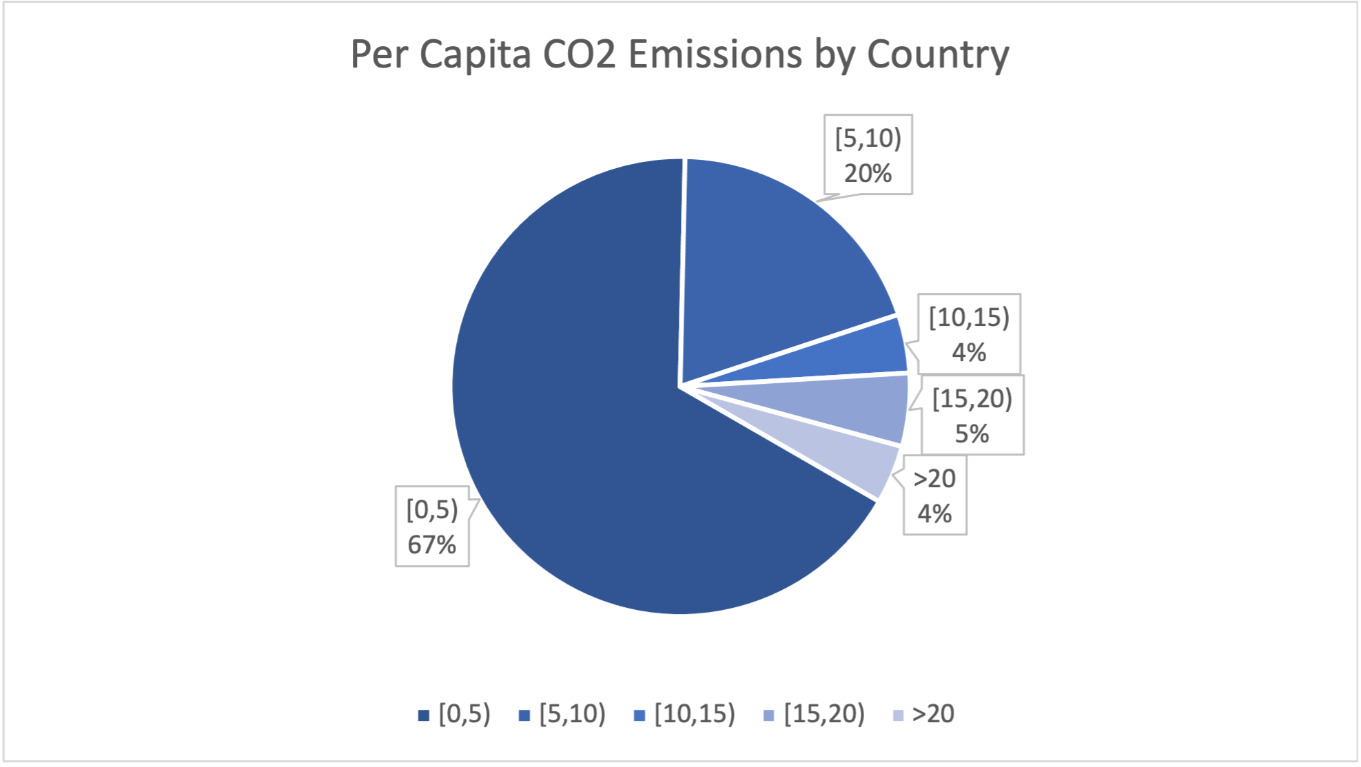
Note that in the image, several wedges represent very small percentages of the total number of countries. This provides very little information and makes the graph more cluttered. Let's re-do our frequency table, combining all of the categories above 20 tons per person into one group:
| Per Capita Emissions | Number of Countries | Relative Frequency |
|---|---|---|
| [0,5) | 65 | 67% |
| [5,10) | 19 | 20% |
| [10,15) | 4 | 4% |
| [15,20) | 5 | 5% |
| > 20 | 4 | 4% |
| Total | 97 |
The pie chart now has only 5 categories, and is much less cluttered. The information - that most countries have CO2 emissions less than 5 tons per person, and that only a few countries have very high per capita emissions, is now presented much more clearly.
Subsubsection 5.6.2.3 Scatterplots and Line Graphs
Our next type of graph is used when we have a correspondence between two quantitative continuous data sets. In a scatterplot, we plot a point on the x-y coordinates which represents a pair of data values. Those points, then, can reveal patterns in how the data sets are related.
Our data set for this example will consist of gross domestic product (GDP), a measure of how wealthy a country is, and CO2 emissions. Both of these numbers will naturally be larger for larger countries, because more people will produce more wealth and more CO2, so we consider the per capita numbers, meaning the amount of money or CO2 per person. We can get these numbers by taking the total amount and dividing by the population of the country. If you already know that there is a relationship between data sets because of something like population, dividing out by the value is an easy way to eliminate that relationship. This is called normalizing the data set.
Because our data set has these values for 165 countries, we will not include the data table in the text. The data can be found in gdp and co2 emissions for all countries in 2018 [Excel Spreadsheet] 1 (data from [5.11.1.53]). We can construct a scatterplot by taking each pair of values and creating a point. For example, the nation of Qatar has per capita CO2 emissions of 39.27 tons per person, and a GDP of $153,764 per person. This is because Qatar is a very small nation (Qatar only had 2.7 million people in 2018, when this data was collected) which produces a large amount of oil - oil production is a major source of CO2 emissions and countries with large oil production tend to use more fossil fuels. Qatar would be marked by a dot at x = 39.27, and y = 153,764. Yemen, a country closeWindow() to Qatar, but much poorer and with much less oil production (and which was fighting a civil war in 2018) has per capita CO2 emissions of only 0.35 tons per person, and a per capita GDP of only $2,285 per person. The dot for Yemen would be at x=0.35 and y=2,285.
Here is a scatterplot of the entire data set:
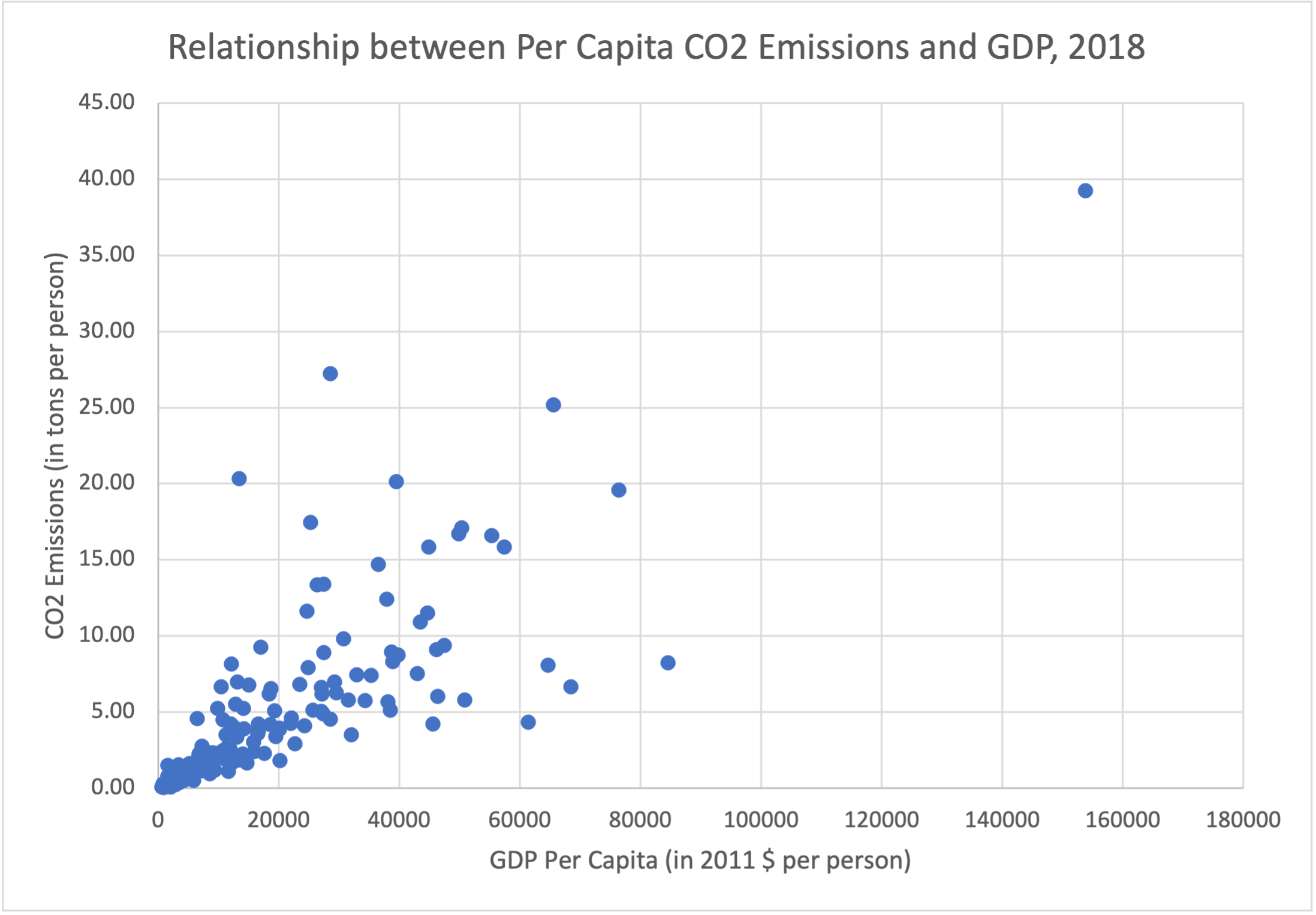
Scatterplots are useful because they help us see patterns in the data. In this graph, we can see that for countries with low emissions and low GDP, an increase in GDP generally corresponds to an increase in CO2 emissions. This makes sense, because we associate increased economic activity with increased usage of fossil fuels. We see this especially in the dot for Qatar, located at the extreme right & top of the graph. However, a number of wealthier nations, including Norway (84,580, 8.21), Singapore (68,402, 6.65), Ireland (64,684, 8.85), Switzerland (61,373, 4.33), and Sweden (45,542, 4.19) don't fit this trend, having much lower emissions than nations with similar GDPs. Similarly, there are a number of nations with much higher emissions than countries with similar GDPs - Trinidad & Tobago (28,549, 27.24), Mongolia (13,383, 20.35), Kazakhstan (25,308, 17.45), and Bahrain (39,499, 20.14). While you can see this from looking at the data table, it is much easier to see these data points that stand out (called outliers) from looking at the scatterplot.
Each of these countries has a unique reason why their CO2 emissions are lower or higher than expected from GDP. Do some research on your own and see if you can explain why they don't fit the general trend of the other points.
When we have two quantitative continuous data sets where there are no repeated values in one data set, a type of scatterplot called a line graph can be used. In a line graph, the data set with no repeated values is marked on the horizontal axis. Adjacent points are then connected by short lines.
Line graphs are used to imply that, although we do not have data values for every x-axis value, we can assume that the data between values follows a similar pattern. The lines are a visual way of indicating this. Line graphs are frequently used when one data set represents time (since there will only be one data value for each time).
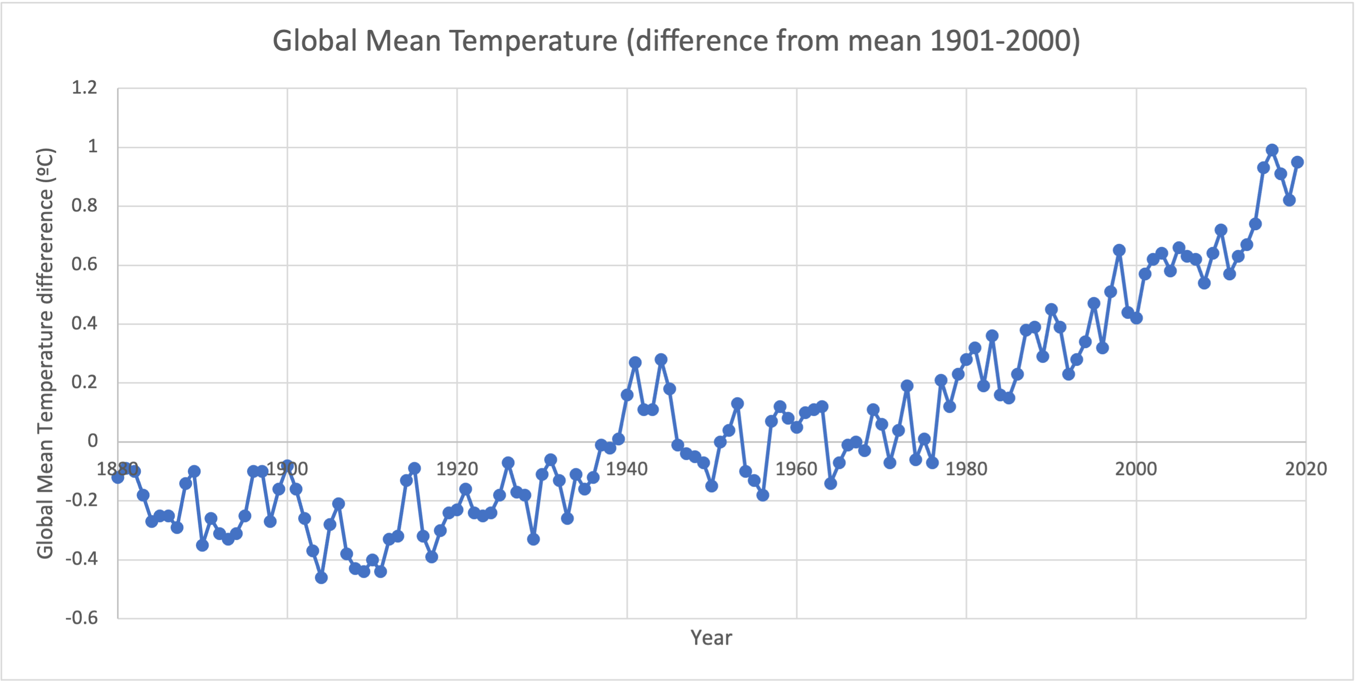
The data in global mean temperature anomalies [Excel Spreadsheet] 2 is from the National Oceanic and Atmospheric Administration (NOAA). This data gives the global mean temperature anomaly for every year from 1880 to 2019. Because we have a correspondence between quantitative continuous data values (year and global mean temperature anomaly), and because there is only one value for each year, this data is an ideal candidate for a line graph.
Subsubsection 5.6.2.4 Combining Graphs
You can show multiple data sets at the same time by combining these graphs in various ways. If the two data sets have quantitative values in the same (or similar) ranges, it may make sense to combine them into a single bar chart (with different colored/shaded bars for each data set) or a single line graph (with a different color/pattern for each data set).
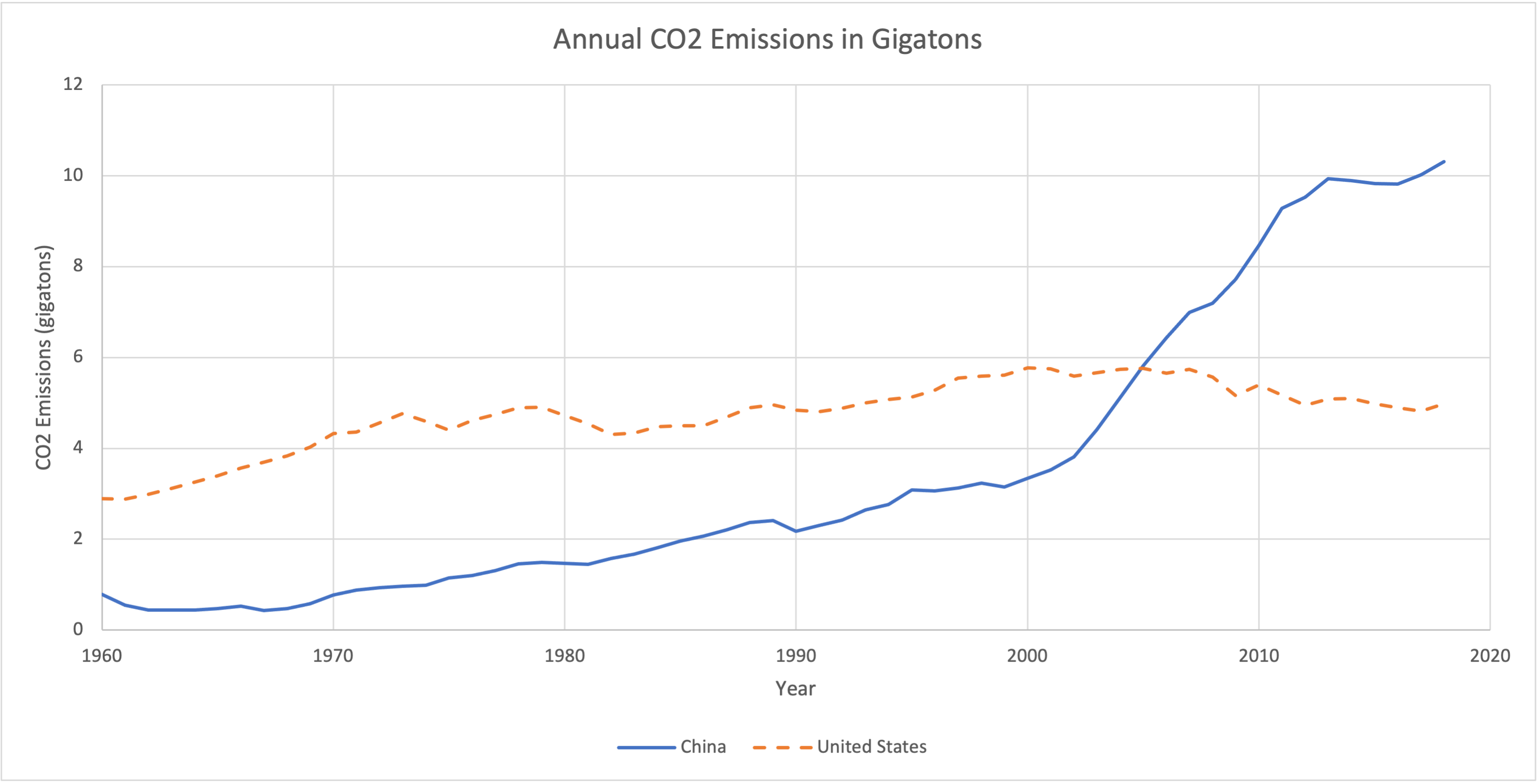
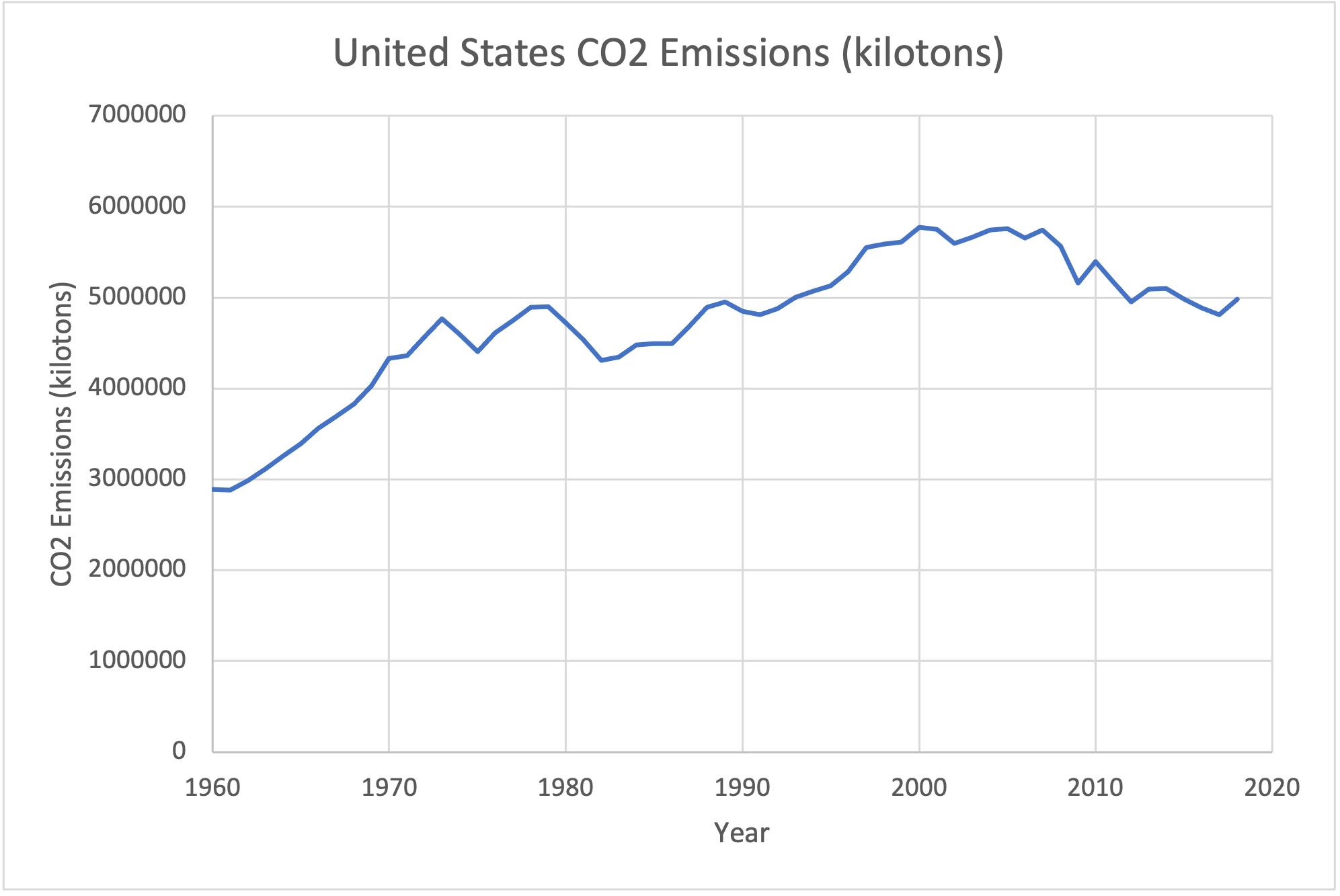
For example, the data in total co2 emissions of the USA and China [Excel Spreadsheet] 3 is from the World Bank. The data gives the CO2 emissions of the United States and China from 1960 to 2018 in kilotons. Because these data sets have a similar scale, we can display them on a single graph. We use a line graph because the data set is quantitative continuous and has a single value for each year.
If you have data with very different scales, though, a paired line graph is not a great choice. Consider the graph below, which shows CO2 emissions for the United States again (in gigatons) and the emissions for Singapore, a much smaller nation with much lower emissions.
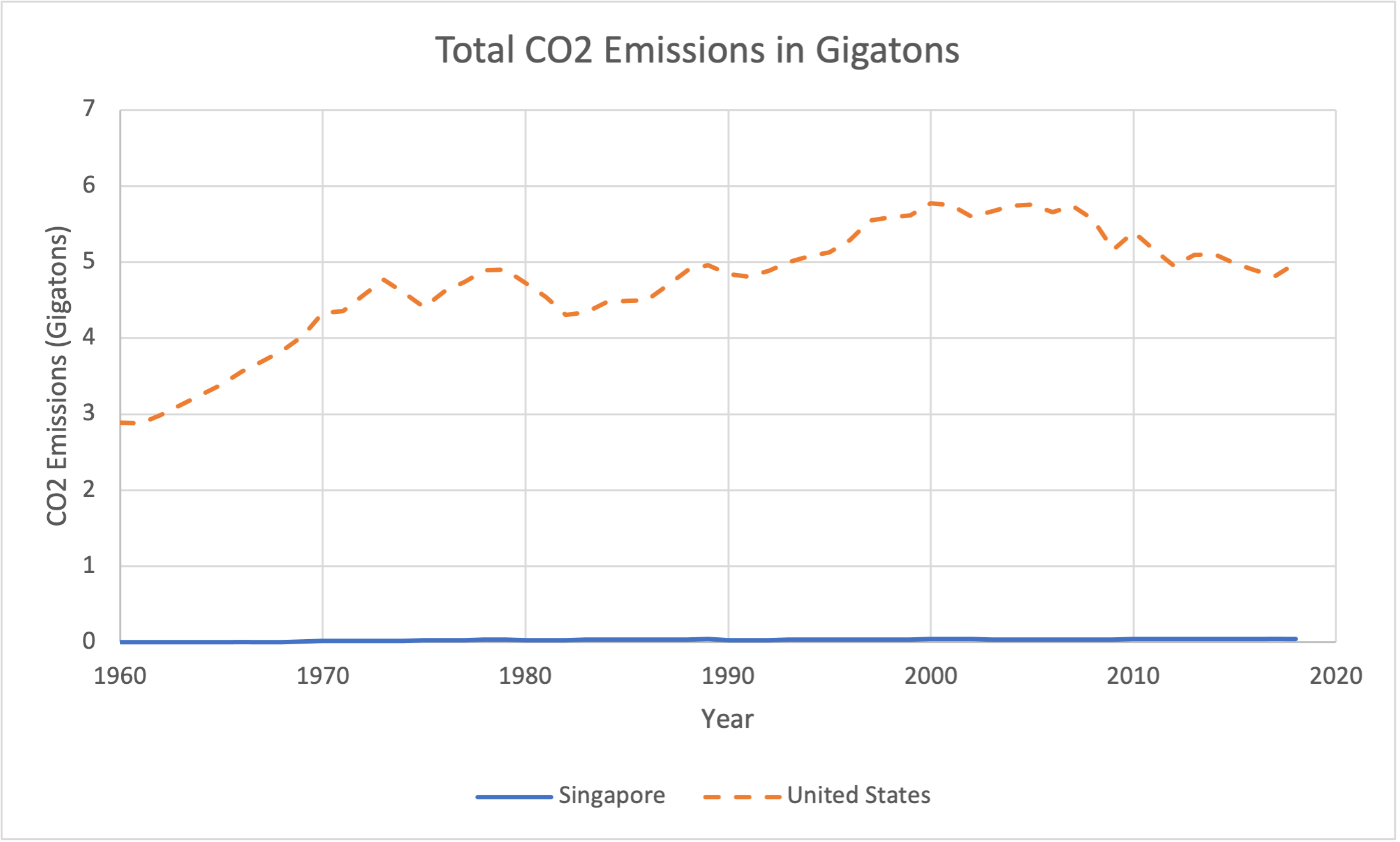
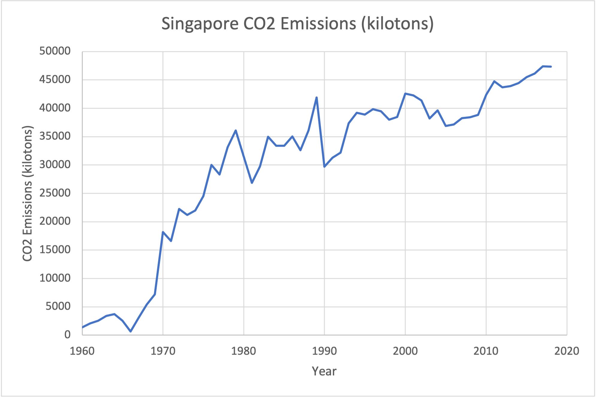
Because Singapore's emissions are so much less than those of the United States, the graph shows them to be essentially 0 - which is not the case. We don't see anything of the pattern of how Singaporean emissions have changed over the past 60 years because the US emissions are so much larger. To show these two data sets together, it is better to graph them each individually.
Bar charts can be combined in a similar way - putting bars for two different things on the same graph if they have similar scales, or putting two bar charts side by side if they have different scales. Here's a bar chart that shows the percentage of households that own 0, 1, 2, 3, 4, or 5+ vehicles in Great Britain and in the United States.
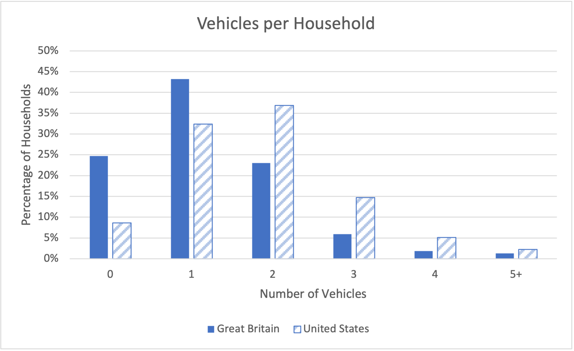
Looking at a paired bar graph like this can help you compare the amounts for different data sets. For example, this graph shows us that Americans tend to own more cars per households than the British, and are more likely to have a car in their household.
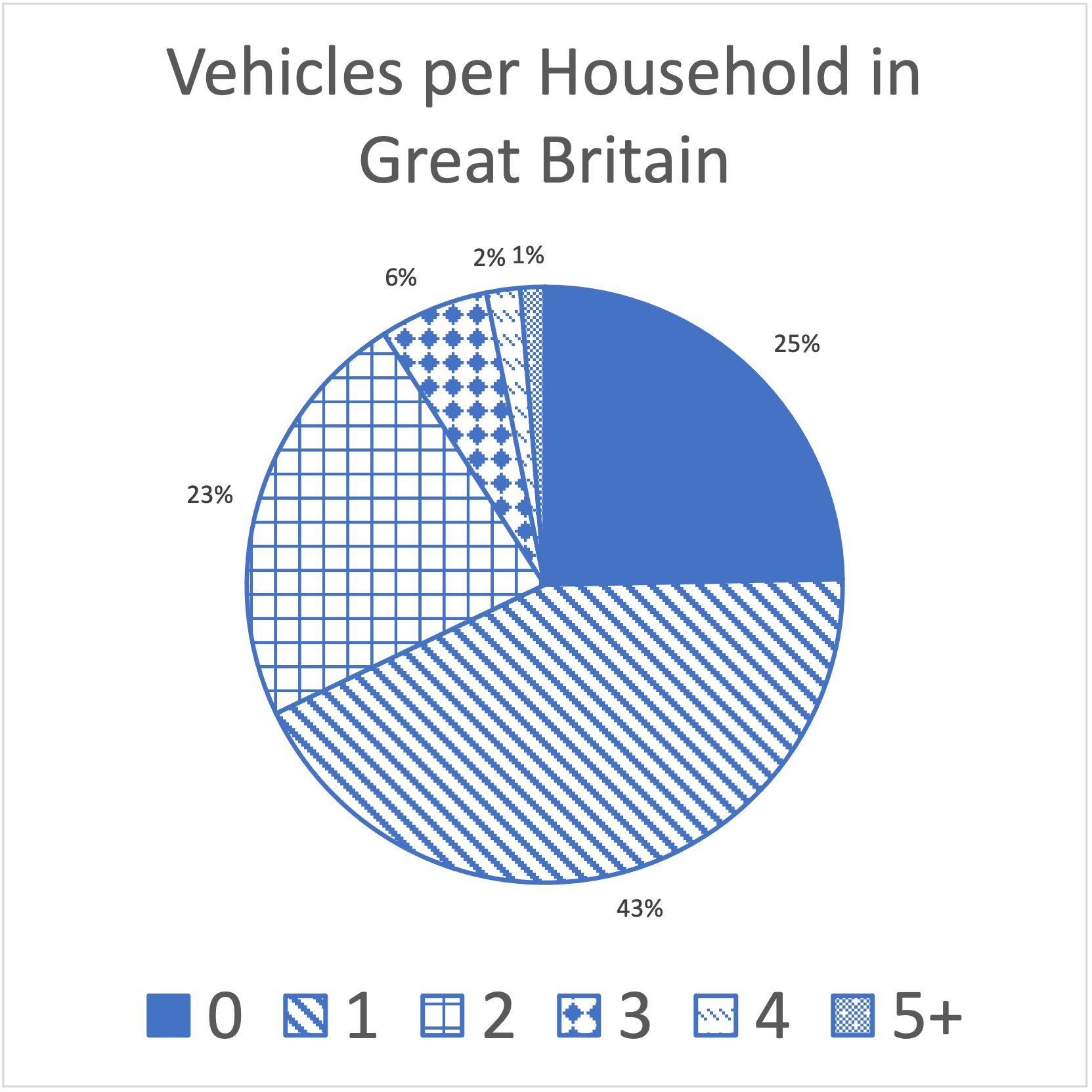
If we want to compare two data sets using pie charts, you can take the same approach and look at two pie charts side-by-side.
A more effective way to display the data from two pie charts is to combine them into a stacked bar chart. A stacked bar chart is used to compare the relative frequencies of data in two different data sets. The data can be any kind of data, but if it is quantitative continuous it will need to be divided into categories. In a stacked bar chart, each bar acts like a pie chart - with the different sections of the bars representing the percentages of the entire group. Each bar goes all the way from the bottom (0%) to the top (100%), split up into pieces which represent the percentages.
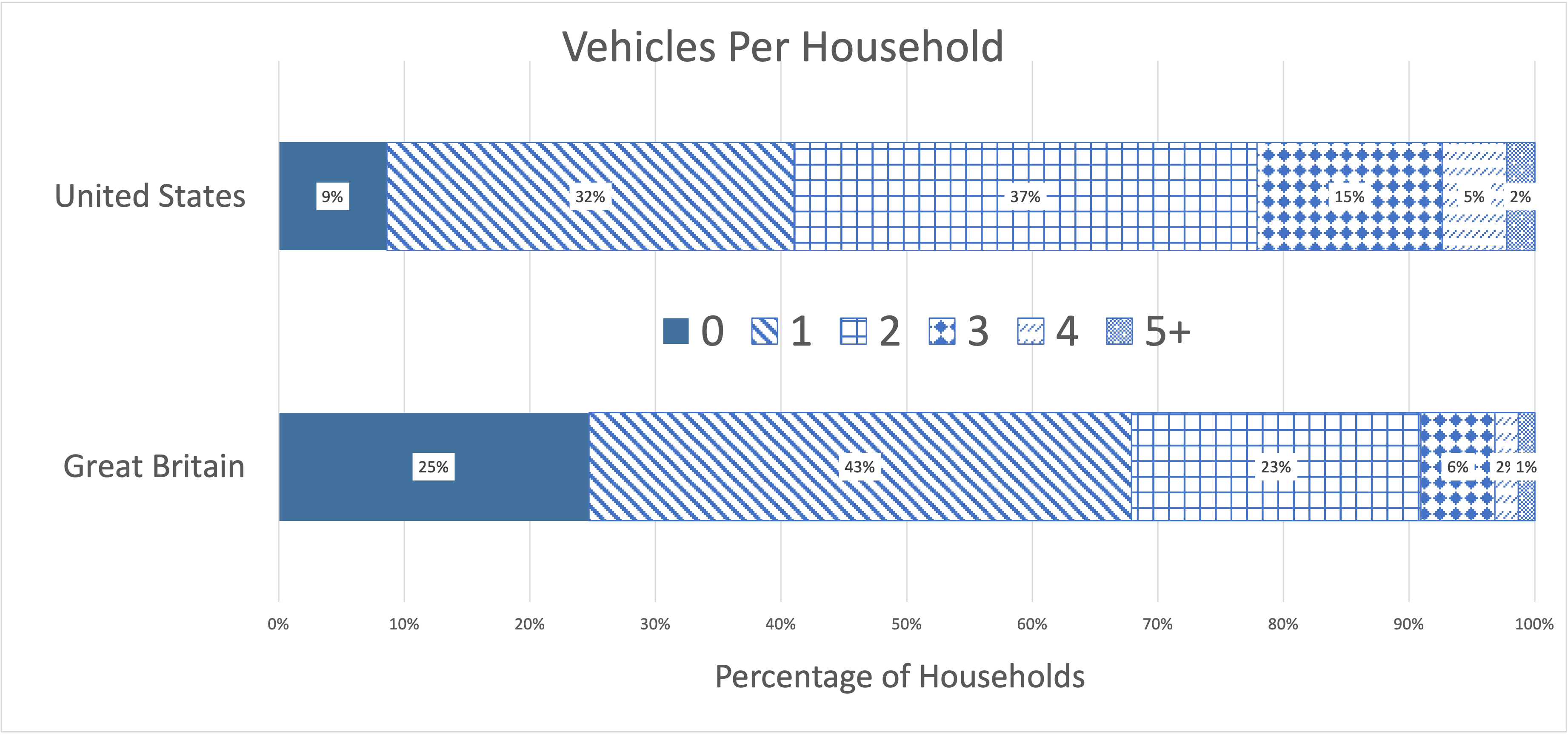
Notice here that our bar chart is horizontal instead of vertical. This is entirely an aesthetic choice - we can do horizontal or vertical bars for any chart. You should do whichever looks better or fits better in your document. Here, we used horizontal bars so that we could fit the percent values on each section of the bar.
Subsubsection 5.6.2.5 Other Ways of Visualizing Information
The internet has greatly changed the way that people visualize data. With books, magazines, and newspapers, data visualizations were restricted to static images like graphs and charts. The modern internet provides the ability to use more dynamic and interactive data visualizations. These data visualizations can be useful and help people understand data better, but they can also be overwhelming. We'll look at some examples and talk about the advantages and disadvantages of these types of data visualizations.
One example of a data visualization using the internet is a video which shows multiple different graphs. Sometimes these visualizations will just be a series of graphs like the ones we've seen before. For example, the graph in Figure 5.6.21 showed the relationship between the gross domestic product (GDP) and CO2 emissions per person for countries in 2018. The video in Figure 5.6.31 shows the same data, but for every year from 1961 to 2014. It also adds another data set - how much the temperature in that country has gone up or down from the average over 1961-2018. The temperature change is represented by the color and size of the dot.
This graph contains a lot of information - 3 different data sets (GDP, CO2 Emissions, and temperature change) for every country for every year from 1961-2014. Looking at all of that data in a table could be overwhelming, but this visualization makes it easier to see certain patterns. We can see that in general, as time changes, the nations of the world are getting richer (the points move right), producing more CO2 (the points move up), and hotter (the points get larger and more red). We can also see that despite all these changes, inequality persists - some countries remain poor while others get even more wealthy.
In some ways, though, the visualization also hides other information. This graph uses a logarithmic scale on both axes. In a normal scale on a graph (what we call a linear scale in mathematics), when you go a unit over on the graph, you add the same amount on the scale - so you may go from 10 at one mark, to 20 at the next, to 30 at the next, adding 10 each time. In a logarithmic scale, instead of adding each time, you multiply by the same amount. For example, on this graph, the marks on the horizontal axis go from 100 to 1000, multiplying by 10, and then to 10,000, multiplying by 10 again, and then 100,000, multiplying by 10 again.
Logarithmic scales are used when we have very small numbers and very large numbers in the same graph, like we do here - some countries have much lower GDPs than others, because of global wealth inequality. The logarithmic scale conceals an increase in inequality in this graph - as the points move to the left and up, the gap between the poorest & least emitting countries and the wealthiest & most emitting countries is getting larger and larger.
Other video data visualizations use different graphing techniques. The video in Figure 5.6.32, the position of the points doesn't really convey any information (it's just determined by the country's name in the English alphabet), but the size and color of the dot gives the temperature anomaly for that country in a particular month. You can see the points get larger and redder as the climate warms.
The visualization in Figure 5.6.32 gives the viewer a very clear picture of how severe and widespread the warming has been in countries around the world. It does not, however, give a lot of data on how that warming is spread out, because the countries are arranged alphabetically. The video in Figure 5.6.33 shows the CO2 emissions per country for each year from 1850 to 2016, but arranged on a map of the world (unfortunately, a Mercator projection, which creates a biased map where northern countries appear much larger than those near the equator). This allows the viewer to see a different kind of pattern - the geographical relationship between countries with high CO2 emissions.
Figure 5.6.33 shows us that greenhouse gas emissions per person have grown most in large fossil fuel producing nations like the USA, Canada, and Russia, as well as smaller nations in West Asia like Oman and Saudia Arabia. It does conceeal some of the highest emitters, like Bahrain and Qatar, which can be seen in Figure 5.6.31, because they are too small to show up clearly on the map.
Data visualizations on the internet can also be interactive. The Earth Sciences Communications Team at the National Aeronautics and Space Association's (NASA) Jet Propulsion Laboratory has produced several outstanding interactive data visualizations around climate change. The Climate Time Machine 6 allows viewers to see how the climate has changed over time in four different ways - sea ice, sea level, CO2 emissions, and temperature change. Earth Now 7 is even more elaborate, allowing the viewer to display a wide range of global data sets on an animated globe, and to look at that data over a range of time or at a point in history.
Subsubsection 5.6.2.6 Accessibiliity
All of these data visualizations - both the static images we saw before and the videos here - have one major flaw. These visualizations, because they convey data visually, are only accessible to people without visual impairment. People with no sight or sight which is limited in some way (like color-blindness) may be unable to use data visualizations as effectively as people without visual impairment.
Visualizations can also present challenges to other people. A fast-moving video, for example, may be difficult to follow for someone with dyslexia who needs more time to read. Someone who is hearing-impaired may need captions if there is spoken text or sounds. Translators exist for text in webpages, but the text in an image or video cannot be translated easily into another language.
When creating data visualizations, it is important to think about who will be able to use it. The more accessible you make your visualization, the more people will be able to benefit from it. Here are some tips for how to make your data visualizations accessible:
Avoid using color alone to differentiate data - and use highly contrasting colors if you do need to use color. People with color-blindness or limited vision may be able to distinguish highly contrasting colors better.
Make data available in another format. A data table - which can be read out by a screen reader - may be more useful than a graph for someone who is visually impaired.
Don't try to let the graph speak for itself - label everything clearly and in a large font. Explain what the graph shows in the accompanying text.
Choose a good title for your graph. People with reading or attention disabilities may read only the title, so make sure it conveys as much information about what the graph means as possible.
Use redundancy - for example, a particular quality may be represented by both the color and size of a dot. If someone doesn't notice or can't detect one quality, they may be able to detect the other.
One example of accessibility is the creation of data sonifications - like a visualization, but with sound. The online graphing calculator Desmos, for example, has a feature called Audio Trace 8 which allows users to hear a graph in the graphing calculator. The sound moves across stereo speakers from left to right, and increases in pitch as the graph increases (with static added when it's negative). This allows visually-impaired people the opportunity to hear the same patterns that others can see in the graph.
A powerful climate change sonification from the Center for Computer Research in Music and Acoustics at Stanford University is "shown" in Figure 5.6.34. In this sonification, which starts roughly 400 years ago, the CO2 levels in the atmosphere provide the pitch for a background tone, while a strumming guitar sound gets louder and higher in pitch as temperature anomalies increase. The result is a haunting sound which becomes more and more urgent as time approaches the present - just like the climate crisis.
data-files/co2-emissions-vs-gdp-2018.xlsxdata-files/global-temperature-anomaly.xlsxdata-files/paired-line-graph-co2-us-china.xlsxcreativecommons.org/licenses/by/2.0/creativecommons.org/licenses/by/2.0/climate.nasa.gov/interactives/climate-time-machineclimate.nasa.gov/earth-now/#/www.desmos.com/accessibility#audio-trace