Section 3.6 Misleading Graphs
Graphs can be a great way to display information in a way that helps people understand the relationships among numbers. For example, Figure 3.6.1 shows temperature changes over the last two thousand years. There is, of course, a lot of variation over time. Then, when we hit the Industrial Revolution, when carbon emissions increased substantially, and the line starts trending upwards very quickly.
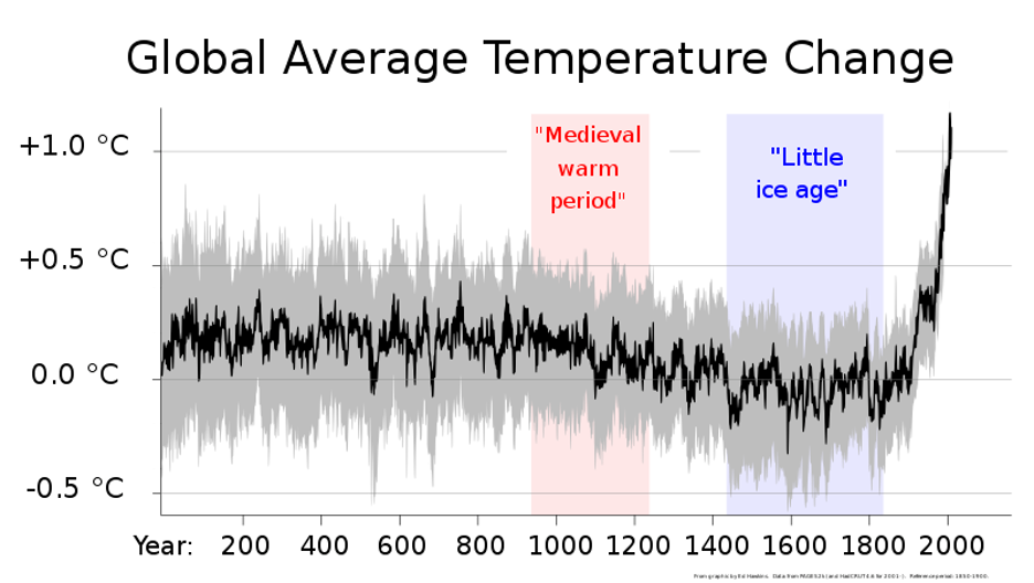
Along the bottom, we see the years marked off in even increments. On graphs, the bottom line starting on the left and going right is the x-axis. On the left side, the temperature range is indicated. It shows the change in average temperature for each year relative to the temperature in the year 1 CE. That left side line with increments of some important variable is the y-axis. In some cases, the x-axis represents time and the y-axis indicates the degree of some phenomena. In other graphs you might see the x-axis as a causal variable and the y-axis as indicating some outcome. So, in the context of climate change, you might see a graph with the amount of carbon emissions on the x-axis and the average world temperature on the y-axis so the viewer can see how the two are related.
But because graphs appear to show objective truth, some people try to abuse that trust people have in graphed data to make things appear differently than they are. As a simple image, such graphs are easily shared online, sometimes with a caption indicating what the viewer is expected to believe as a result. There is a variety of ways to manipulate graphs, we’ll look at two. First, we’ll talk about truncating the y-axis. How wide of a range should you show on the y-axis? What should be the lowest value and what should be the highest? The question is: the y-axis range should go from what to what? In the case of counting things, you might expect the y-axis to range from zero to some plausible number for the most extreme case. But if you wanted to make something look like it was changing more over time you might include a smaller range in the y-axis, which we call truncating the y-axis.
Look at Figure 3.6.2. It shows data from the Uniform Crime Reports from the American F.B.I. [3.10.1.24]. There are plenty of criticism of the accuracy of these data, but setting aside those for a moment, we can use their data to see how to manipulate graphs. I have created a bar graph for the data about the number of murders in the United States in a way that makes it appear that murders went up a lot.
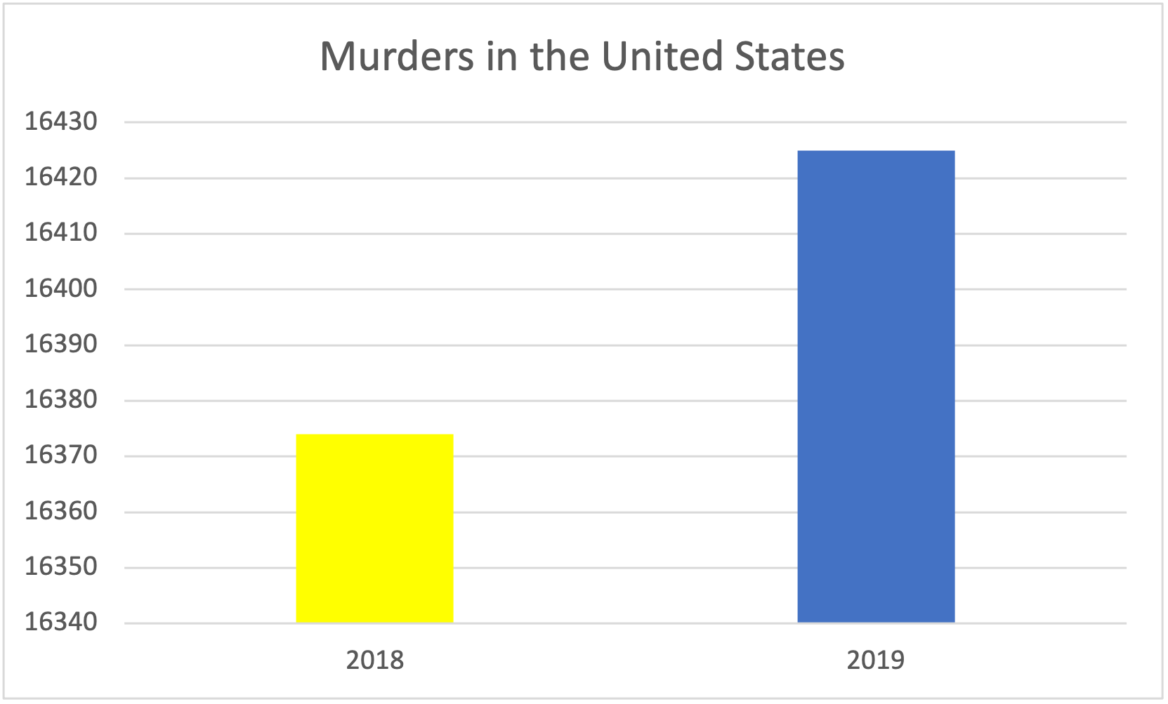
But take a look at the y-axis. The lowest number is not zero, it is 16,340 murders in that year. Take a look at the graph in Figure 3.6.3 of the same data.
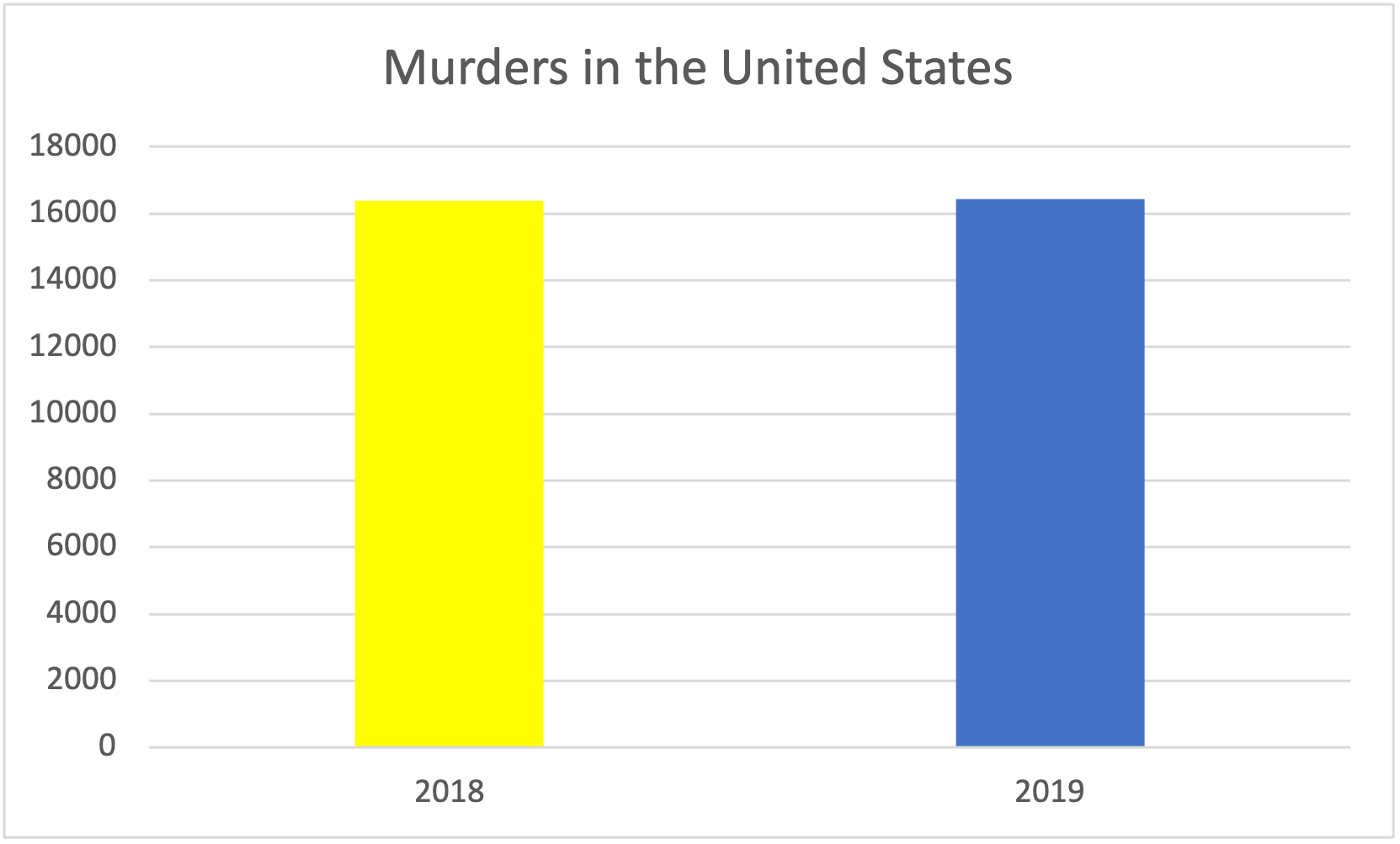
In this graph, the y-axis runs from 0 to 18,000 murders. On this graph, it might even be hard to tell which year had more murders unless you zoomed in or looked at it really closeWindow()ly. To be sure, it is horrible that over 16,000 people were murdered in each of those years. But it seems absurd to argue that there is a big increase in murders when the graph with zero as the lowest point is used.
Let’s look at the same problem with a line graph showing change over several years. In this case, we are looking at the number of robberies in the United States over several years. Figure 3.6.4 shows the change over time in the number of Robberies in the United States, again graphed from F.B.I. data [3.10.1.24].
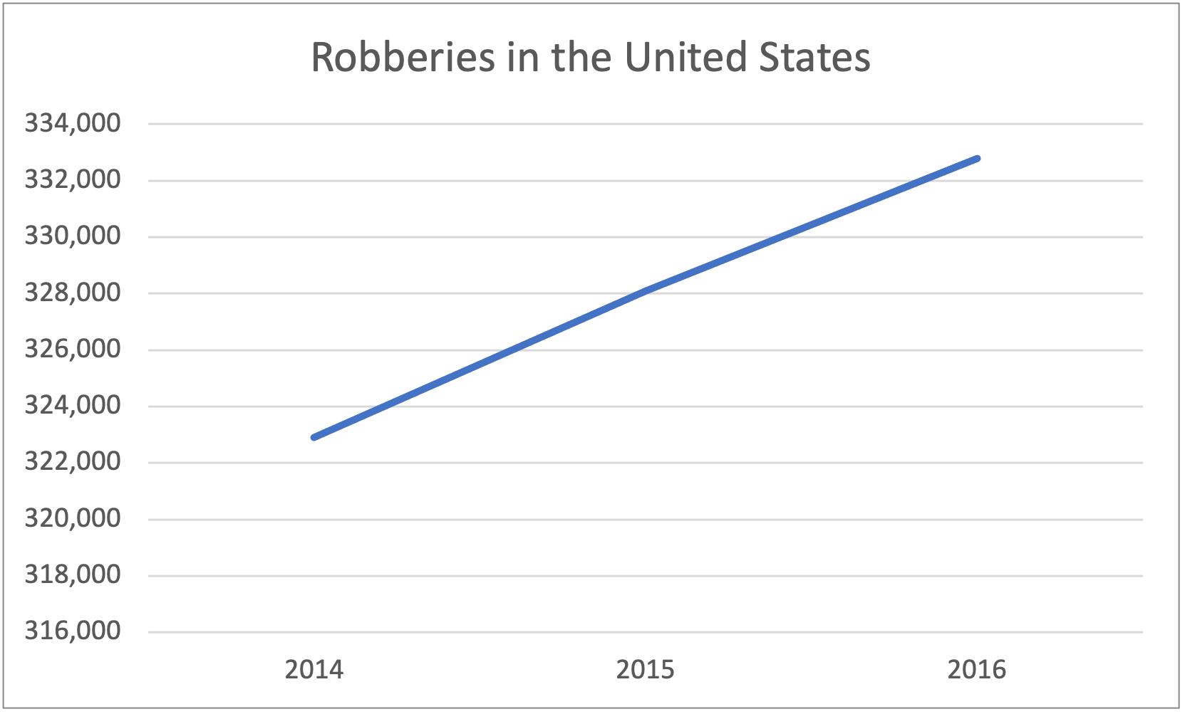
Once again, it looks like robberies were really going up during that time. People seeing this graph might worry that if these trends continue, the streets will not be safe anywhere. They might start thinking about harsher penalties for crimes as possible solutions. But you have probably already noticed the y-axis here. The lowest point is 316,000 robberies, not zero. Figure 3.6.5 shows the same data graphed with zero robberies as the lowest point.
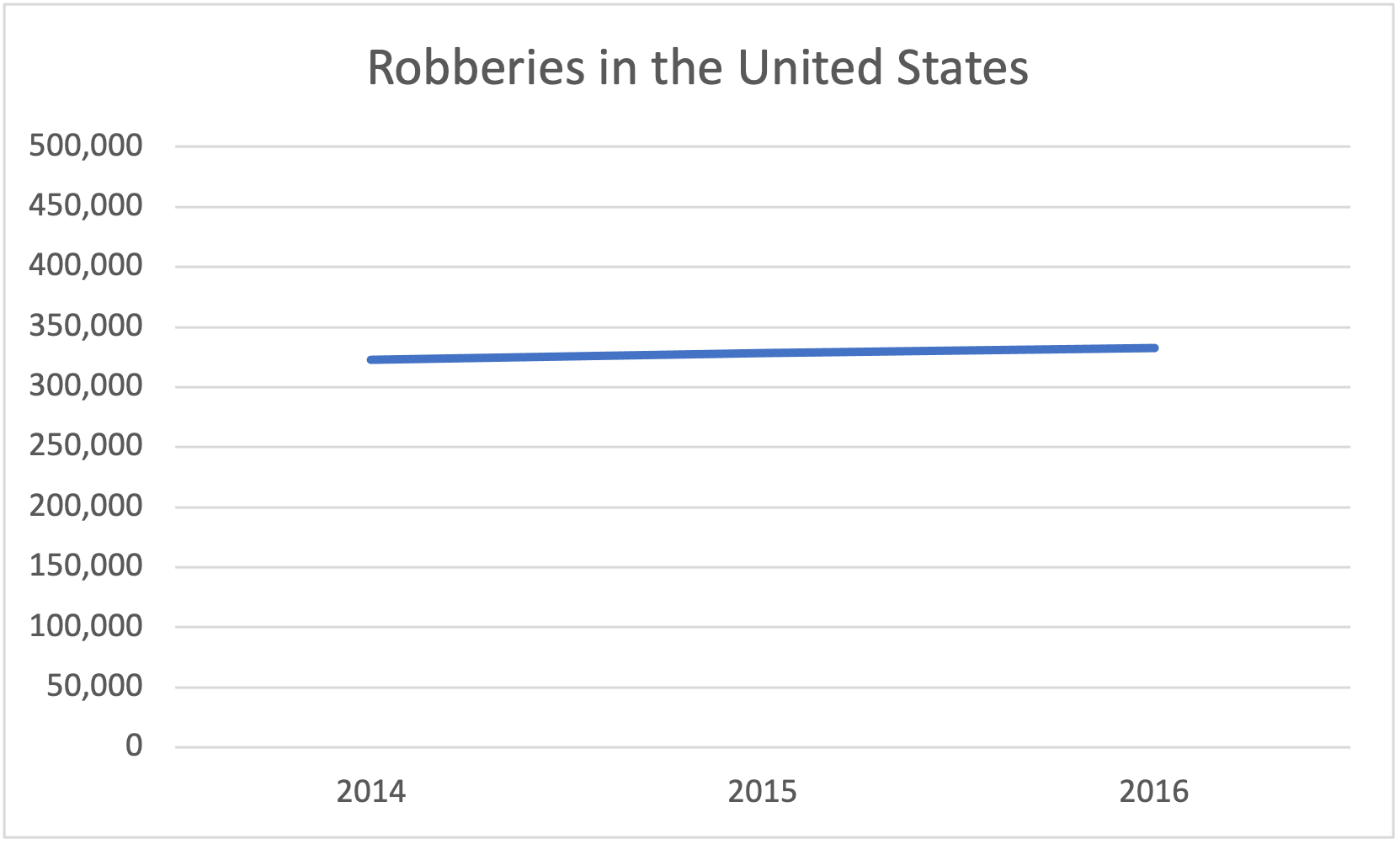
Now it hardly looks like robberies are changing at all. They might have gone up slightly, but it is hardly a massive crime wave happening in 2016 that was not happening in 2014. With the graph in Figure 3.6.5, would you want to devote a lot of public resources to stemming the rising tide of robberies? No one wants to be robbed, but it is not exactly a terrifying increase.
But some of you may have also started wondering about the x-axis. Where’s the data for 2017, 2018, and 2019? The F.B.I. had data for those years for murders in the last graph, where are they for robberies? That gets to the other side of manipulating graphs. Just like you can shrink the range of the y-axis, you can pick whatever range you want for the x-axis. Sometimes people call that “cherry-picking” the data. You only show the data in a graph that supports an argument you want to make and you exclude the data you want to hide. Once again, we’re looking at shady methods of trying to manipulate people. Take a look at Figure 3.6.6, which shows the same graph as Figure 3.6.5, but includes the later years from the report [3.10.1.24].
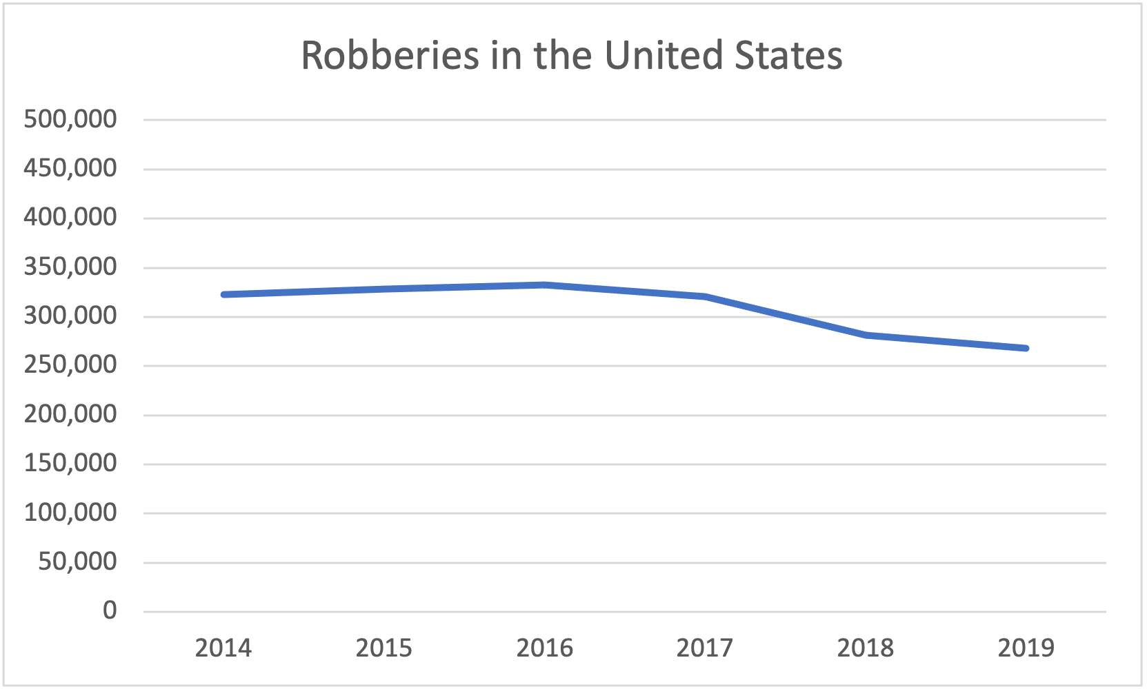
Someone who wanted to argue that the United States was becoming an increasingly dangerous place would be more persuasive if they presented Figure 3.6.5, than Figure 3.6.6. Figure 3.6.6 shows that there is a noticeable drop in robberies in more recent years after the slight uptick for a couple of years.
What counts as an honest graph that is not “fake news”? It is tricky to decide and a lot of it depends on the context. Consider the climate change graph back in Figure 3.6.1. It had a y-axis that ranged from -0.5 C to + 1.0 C. For those of you more accustomed to Fahrenheit rather than Celsius, that’s roughly -1 F to +2 F. You may be thinking, only two degrees hotter? I would barely notice that outside, is this a misleading graph? The thing to keep in mind with this graph is the context. Scientists think that every 0.5 C increase has extremely important impacts on our ability to survive on this planet [3.10.1.25]. Although it might seem like the graph is making a lot out of a little, it is probably a fair graph rather than a misleading one. It is important to consider the context when trying to judge where the y-axis and the x-axis should begin and end. Interpreting numbers always requires critical thinking about what is “a lot” and what is “a little.”
creativecommons.org/licenses/by-sa/4.0/deed.en