
Exercises 5.10 Exercises
1.
The USA released greenhouse gases equivalent to \(6.34*10^9\) metric tons of CO2 in 2021 [5.11.1.84]. Figure 5.10.1 shows where those emissions come from. 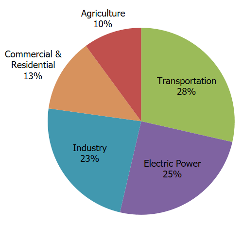
Which sector accounts for the largest part of emissions? How many millions of metric tons of CO2 equivalent gases does that sector emit?
Which sector accounts for the smallest part of emissions? How many millions of metric tons of CO2 equivalent gases does that sector emit?
How could we use the information in this graph to prioritize laws, regulations, and other changes to reduce greenhouse gas emissions?
2.
According to [5.11.1.81], global CO2 emissions were 37.1 billion tons in 2021. Write this number in scientific notation. If there were 7.8 billion people, how many tons of CO2 emissions would that be per person?
Is this a reasonable way to look at per capita emissions? Consider the following two statements:
The average person worldwide uses ___ tons of CO2 per year.
On average, each person worldwide uses ___ tons of CO2 per year.
where the blank is filled in with your answer. Do you agree with these statements? Why or why not? What is the danger of using an average with a quantity like this
Repeat this exercise with just the US (2021 emissions: 5 billion tons, population 331.9 million people). Do these numbers have the same problems as the ones above? Explain.
3.
The graph in Figure 5.10.2 uses data from [5.11.1.95] and shows the 20 corporations which have contritbuted most to global CO2 emissions. The graph gives the total emissions for each corporation from 1965-2018. 
Entity
Country
Millions of Tons of CO2 Equivalents
% of Global Emissions
Saudi Aramco
Saudi Arabia
61143
4.33
Gazprom
Russia
44757
3.17
Chevron
USA
43787
3.1
ExxonMobil
USA
42484
3.01
National Iranian Oil Co.
Iran
36924
2.62
BP
United Kingdom
34564
2.45
Royal Dutch Shell
The Netherlands
32498
2.3
Coal India
India
24338
1.73
Pemex
Mexico
23025
1.63
PetroChina
China
16515
1.17
Petroleos de Venezuela
Venezuela
16029
1.14
Peabody Energy
USA
15783
1.12
ConocoPhillips
USA
15422
1.09
Abu Dhabi
United Arab Emirates
14532
1.03
Kiuwait Petroleum Corp.
Kuwait
13923
0.99
Iraq National Oil Co.
Iraq
13162
0.93
Total SA
France
12755
0.9
Sonatrach
Algeria
12700
0.9
BHP
Australia
10068
0.71
Petrobras
Brazil
9061
0.64
Total
493470
34.96
Why did the person who made this visualization choose a bar chart? Explain why a line graph and a pie chart would each be inappropriate here.
Use the graph and the table to find the four corporations listed from the US. How much have they contributed overall to CO2 emissions? Give your answer in scientific notation.
How could the information in this chart be used to help us create effective strategies to reduce greenhouse gas emissions?
4.
The file Emissions by Country/Region 1 from [5.11.1.93] gives data for countries and regions around the world. The data includes:
Country Name
Population
Total CO2 Emissions in 2021.
CO2 Emissions per capita - the total CO2 emissions divided by the population in 2021.
Cumulative CO2 emissions over history.
The change in atmostpheric CO2 due to land use. This can be positive or negative - if countries plant more trees, for example, that would reduce atmospheric CO2, while clearing land or changing how it is used can increase emissions.
CO2 emissions from land use per capita.
Share of CO2 emissions in 2021, as a percentage of global emissions in 2021.
Share of cumulative global CO2 emissions over time, as a percentage of cumulative global emissions.
Share of temperature change from greenhouse gas emissions. Certain changes or types of emissions can have larger effects on temperature change, so this may be different that then the percentage of CO2 emissions.
Use the data in the spreadsheet to answer these questions:
Create a graph of the total CO2 emissions of the 10 countries with the highest emissions in the list. What kind of graph did you choose to make and why?
Create a graph which shows the percentage share of CO2 that each continent or region (the continents/regions listed are Africa, Asia, Europe, North America, Oceania, and South America) has emitted. What kind of graph did you choose to make and why?
Taking all the countries with populations smaller than the USA, create a graph which shows the relationship between population and the percentage of CO2 emissions which the country is responsible for. What kind of graph did you choose and why? Does there seem to be a relationship between the size of the country and the percentage of CO2 emissions they're responsible for.
5.
Use the data from Emissions by Country/Region 2 to answer the following questions:
What kind of data is the variable land_use_change_co2_per_capita, which gives the per capita CO2 emissions due to land use change for each country or region?
This variable gives the CO2 emissions from changes in land use, like clearing of land for agriculture or housing, open-pit mining, or elimination of wetlands. The values for per capita land use CO2 emissions range from -3.674 tons per person (Vanuatu) to 8.483 tons per person (Bhutan). Explain why you would need to use a histogram to display this data.
Create a frequency table using intervals of width 1 (\([-4,-3),[-3,-2),\ldots,[7,8),[8,9)\)) for per capita land use emissions from the countries listed in the data - you can omit continents, regions, and groupings of countries by income.
Use the frequency table you created in Item 5.10.5.c to create a histogram of the per capita land use emissions for the countries.
What does the histogram tell you? Are there a lot of countries with positive land use emissions per capita, or very few? Do most countries have positive or negative emissions per capita? What does this histogram tell you about how we should focus our efforts to reduce greenhouse gas emissions from land use?
We built our histogram for per capita land use change CO2 emissions. The table also has overall land use change CO2 emissions for each country (the land_use_change_co2 variable). Why is it easier to create a histogram for the land use per capita data than the overall land use CO2 emissions? Why is it more useful to use per capita data to understand patterns in emissions than overall land use CO2 totals?
6.
The data in USA CO2 Emissions 3 gives the CO2 emissions (in millions of tons) and per capita CO2 emissions (in tons per person) for the USA for each year since 1800 [5.11.1.93]. Use the data to answer the following questions:
Create a graph of the CO2 emissions from 1800 to 2022. What kind of graph did you use and why?
Use the same kind of graph to graph the per capita CO2 emissions from 1800 to 2022. How are the patterns in the graph similar to those in Item 5.10.6.a? How are they different?
CO2 emissions rose steadily in the USA until 2005, with some notable exceptions. Look at the graphs and the data to find at least two periods where CO2 emissions dropped for multiple years in a row. What was going on in the USA when this occurred that could have caused the reduction in emissions?
Since 2005, CO2 emissions have fallen in the USA. Using your own research, list a few possible explanations for what has caused this reduction in emissions.
7.
Use the data provided in Exercise 5.10.4 to create a graph for each of the following questions. Explain why you chose to create the graph that you did and how it helped you answer the question.
Are the continental regions which have contributed the most to cumulative global emissions the same ones that are currently contributing most to global emissions?
Do countries that have high CO2 emissions per capita also have high CO2 emissions from land use per capita?
Do countries with higher incomes have higher per capita CO2 emissions?
Which countries have the highest per capita emissions?
8.
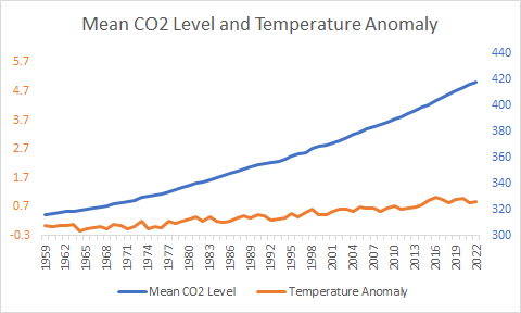
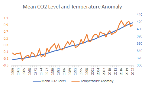
The file at CO2 Levels and Temperature Anomalies 4 (Data from [5.11.1.54] and [5.11.1.94]) gives the following data for every year since 1959:
The mean annual CO2 level recorded at the Mauna Loa Observatory in Hawaii in parts per million (ppm).
The mean annual global temperature anomaly gives the number of degrees Celsius that the mean global temperature differs from the mean temperature during the years 1901-2000. If the temperature in a year was exactly average for the 20th century, then the anomaly would be 0. If it is higher than the average for the 20th century, it will be greater than 0 - and less than 0 if it is lower.
Create a graph of the relationship between CO2 levels and the global temperature anomaly. Explain why you chose the graph you did. Does there appear to be a relationship between global CO2 levels and a rise in temperature?
9.
The two graphs shown below in Figure 5.10.4 both use the data from CO2 Levels and Temperature Anomalies 5 .
Answer the following questions about these graphs:
In the first graph in Figure 5.10.4, does it look like CO2 is increasing, decreasing, or staying the same? What about the temperature anomaly?
In the second graph in Figure 5.10.4, does it look like CO2 is increasing, decreasing, or staying the same? What about the temperature anomaly?
From looking at the first graph in Figure 5.10.4, what conclusion might you draw about the relationship between CO2 levels and temperature? What about from the second graph in Figure 5.10.4?
What makes the two graphs in Figure 5.10.4 look so different, even though they show the same data?
These graphs - usually called dual axis charts are frequently used in misleading ways. Read more on your own about dual axis charts. Can they be used effectively, or do you think they are best avoided?
10.
The data in Table 5.10.5 gives the percentage of newly registered vehicles in some European countries that are fully electric, plug-in hybrid, hybrid, gasoline, or diesel in 2019 (data from [5.11.1.96]).
Entity
Percent Electric
Percent Plug-in Hybrid
Percent Hybrid
Percent Gasoline
Percent Diesel
Austria
3%
1%
4%
53%
40%
Belgium
2%
2%
4%
62%
31%
Denmark
2%
2%
6%
63%
27%
Finland
2%
5%
12%
62%
19%
France
2%
1%
4%
58%
35%
Germany
2%
1%
4%
59%
34%
Greece
0%
0%
5%
68%
27%
Ireland
3%
1%
9%
40%
46%
Italy
1%
0%
5%
53%
41%
Luxembourg
2%
2%
4%
50%
44%
Netherlands
14%
1%
6%
71%
8%
Norway
42%
14%
12%
16%
16%
Portugal
3%
3%
4%
50%
40%
Spain
1%
1%
8%
58%
33%
Sweden
4%
7%
10%
45%
34%
Switzerland
4%
1%
6%
60%
28%
Turkey
0%
0%
3%
46%
51%
United Kingdom
2%
2%
7%
64%
27%
Use the data in Table 5.10.5 to create a graph of the types of vehicles driven in Ireland. Why did you choose the type of graph you did? What does the graph tell you about the types of cars people drive in Ireland?
Use the data in Table 5.10.5 to create a graph of the percentages of vehicles which are electic, plug-in hybrid, or hybrid in each country,. Why did you choose the type of graph you did? What does the graph tell you about the usage of electric/hybrid cars across Europe?
Use the data in Table 5.10.5to create a graph which compares the types of vehicles driven in Norway and the United Kingdom. Why did you choose the type of graph you did? What does the graph tell you about the differences between Norway and the United Kingdom?
11.
The data in Table 5.10.6 gives the percentage of newly registered vehicles in Norway that were fully electric, plug-in hybrid, hybrid, gasoline, or diesel from 2013 to 2019 (data from [5.11.1.96]).
Year
% Electric
% Plug-in Hybrid
% Hybrid
% Gasoline
% Diesel
2013
6%
0%
7%
35%
53%
2014
13%
1%
7%
31%
49%
2015
17%
5%
7%
30%
41%
2016
15%
14%
11%
29%
31%
2017
19%
20%
13%
26%
23%
2018
31%
18%
11%
23%
18%
2019
42%
14%
12%
16%
16%
Graph the percentage of fully electric vehicles in Norway for each year since 2013. Explain why you chose the graph that you did.
Create a graph of the percentages of electric (fully electric, plug-in-hybrid, hybrid) and petroleum (gasoline, diesel) in Norway for each year from 2013 to 2019. Explain why you chose to graph them the way that you did.
Subsection 5.10.1 Generative AI Prompts
Consider using the following prompts with generative AI, such as Chat GPT, to develop additional exercises for this material. These programs can also be used to generate solutions, but those solutions will not necessarily be correct! These prompts have been tested with ChatGPT [5.11.1.97].
Give me 5 questions that use examples from greenhouse gases, climate change, and global warming to teach students about using scientific notation and working with large numbers.
Give 5 questions which encourage students to explore data visualizations of greenhouse gas emissions data
greenhouse-gas/data-files/owid-emissions-by-country.csvgreenhouse-gas/data-files/owid-emissions-by-country.csvgreenhouse-gas/data-files/owid-emissions-usa.csvgreenhouse-gas/data-files/co2-and-temperature-anomaly.csvgreenhouse-gas/data-files/co2-and-temperature-anomaly.csvgreenhouse-gas/data-files/vehicle-type-percentages.csvgreenhouse-gas/data-files/norway-vehicle-types.csv