
Section 5.8 Solving for Change
How can the mathematics we've learned help us to understand the issue of greenhouse gas emissions better? And how can it help us find solutions and areas to focus our energy?
We're going to use our mathematics knowledge to try to answer three questions: Who is responsible for greenhouse gas emissions, what are the strategies for reducing emissions, and what are the most effective ways for us to combat climate change?
Subsection 5.8.1 Who is responsible for greenhouse gas emissions?
The question of responsibility for greenhouse gas emissions has emerged as a major one in recent years. The Kyoto Protocol, a 1997 treaty, and the Paris Climate Accords, in 2016, sought to set targets for individual nations to reduce their greenhouse gas emissions. These treaties approached climate change from the perspective of shared responsibility, in a historical sense. Figure Figure 5.8.1 shows how this responsibility for global emissions has changed over time in a stacked 100% line graph. A stacked 100% line graph is like a pie chart stretched out over time - each vertical "slice" of the graph represents the percentage that that region contributed to global greenhouse gas emissions in that year. You can see in the graph that at the beginning (1750), Europe contributed 100% of the recorded emissions of CO2. As time goes on, other regions, like the USA, began to contribute more, and in the 20th century emissions from other parts of the world, like China, India, and the remainder of North America, began to grow.
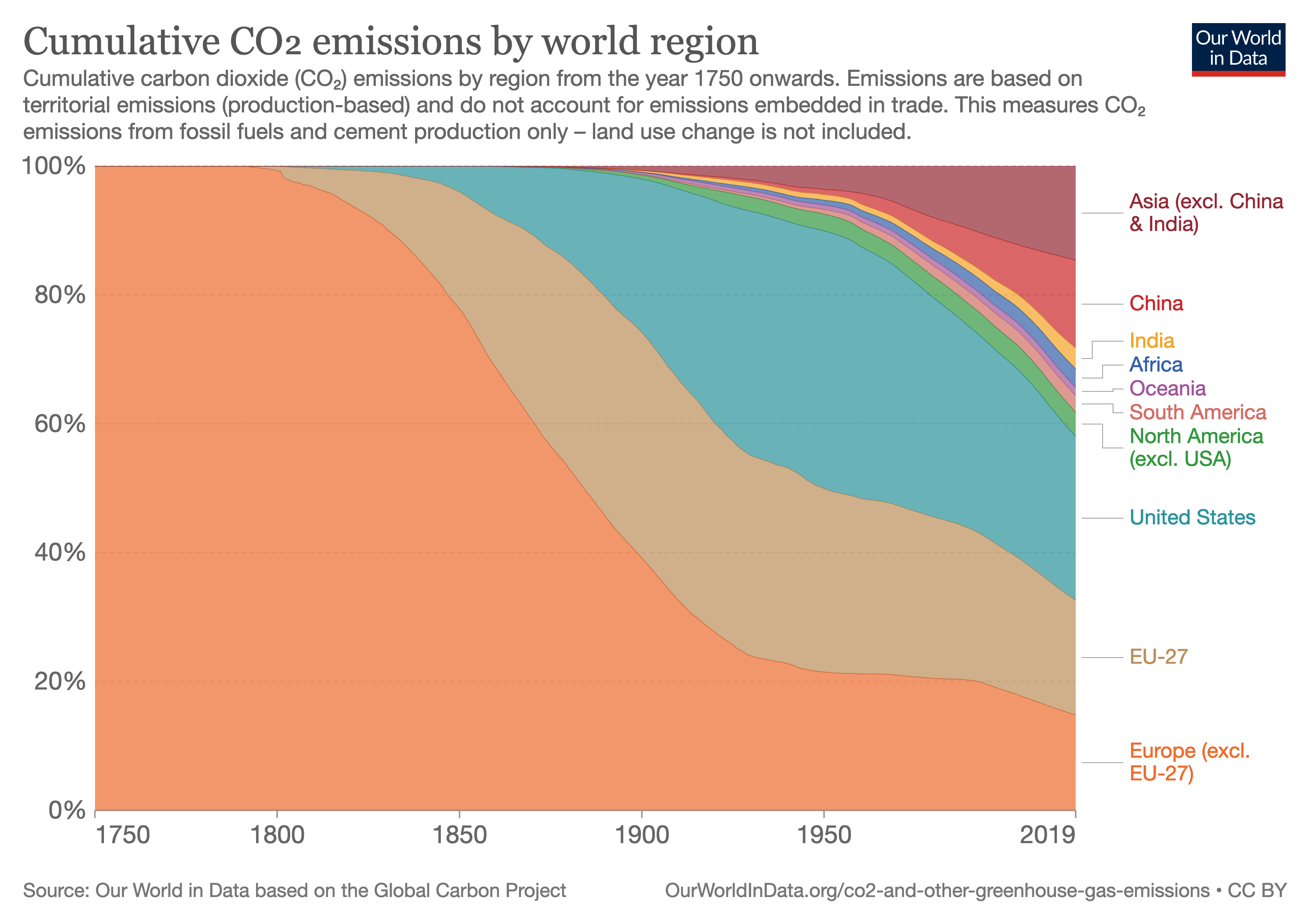
In the Kyoto Protocol and the Paris Climate Accords, one of the main points of discussion was how much each nation should be asked to cut their emissions. Major emitters today, like China and India, argued that the burden of stopping greenhouse gas emissions should fall mainly on developed nations like the United States, the United Kingdom, and other European countries, because the CO2 that those nations emitted in the past has been and still is a major contributor to climate change. Those nations now enjoy a high quality of life at least in part because of the emissions which they made in the past, but many have substantially reduced their emissions already. Emissions from Europe & the United States account for 58% of total cumulative emissions since 1750, but only 30% of current emissions in 2019 [5.11.1.79].
Developed nations, on the other hand, argued that emissions reductions must be made by developing nations like China and India, because those nations account for such a large part of current emissions. While Asia accounts for 29% of historical emissions since 1750, in 2019 they accounted for 55% of current emissions, as seen in Figure Figure 5.8.2. Because they account for such a large part of current emissions, substantial reductions in their emissions would make a much larger difference in future CO2 levels.

The Paris Climate Accords provided a mechanism for countries to set individual commitments to reducing emissions. These commitments are reviewed every 5 years, with the overall goal of limiting temperature rise to another \(1.5^\circ C\text{.}\) The agreement also seeks to provide funding to developing nations to help them reduce their emissions [5.11.1.80]. This agreement seeks to strike a balance between the responsibility of nations who have already contributed to current greenhouse gas levels, and those nations which are contributing now.
This table contains the emissions for each region in 2019 [5.11.1.81] and the population of each region in 2019 [5.11.1.82]. We use data from 2019 so that we can ignore the effects of the pandemic, which caused an (unfortunately, short-term) reduction in CO2 emissions that was unequal across different regions.
| Region | 2019 Emissions | Population |
| International Transport | \(1.26*10^9\) | - |
| Oceania | \(4.71*10^8\) | \(4.2*10^7\) |
| Asia (excluding China & India) | \(7.49*10^9\) | \(1.8*10^9\) |
| China | \(1.05*10^{10}\) | \(1.43*10^9\) |
| India | \(2.63*10^9\) | \(1.37*10^9\) |
| Africa | \(1.41*10^9\) | \(1.31*10^9\) |
| South America | \(1.07*10^9\) | \(4.27*10^8\) |
| North America (excluding USA) | \(1.2*10^9\) | \(2.58*10^8\) |
| United States | \(5.26*10^9\) | \(3.29*10^8\) |
| Europe (excluding EU-27) | \(2.52*10^9\) | \(2.35*10^8\) |
| EU-27 | \(2.91*10^9\) | \(5.13*10^8\) |
| Total | \(3.67*10^{10}\) | \(7.71*10^9\) |
What does this table tell us about each region's share of emissions? Use the data in the table to answer the questions below.
Checkpoint 5.8.4.
Which region on this list contributed the most CO2 to the atmosphere in 2019?
Hint.Checkpoint 5.8.5.
Some countries,like China, argue that their emissions are naturally higher because they have more people. Compare the United States and China - if you look instead at tons of CO2 per person, which one has higher emissions?
Hint.What are the factors that should be used in deciding how much each country should reduce emissions? Should the population of the country play a role in making this decision? What about the overall wealth and how developed the country is? Should larger countries, like India and China, that are still developing be allowed to reduce emissions less than well-developed regions like the USA and Europe? The effects of global warming are also unevenly distributed, with low-lying, typhoon-prone countries in Oceania and drought-prone & desertifying countries in Africa being hardest hit. These regions have lower emissions (Oceania's total is skewed up by the presence of Australia and New Zealand, both highly developed countries with higher emissions). Should they be asked to make the same sacrifices as other nations in terms of cutting emissions, when they will also need to be dealing with the other consequences of global warming? All of these are questions that mathematics can help us understand, by allowing us to compare the quantities involved, and the consequences of changing those quantities.
Subsection 5.8.2 What are the strategies for reducing emissions?
You may have heard of the carbon footprint, a particular individual's contribution to the carbon dioxide in the atmosphere. The idea of a carbon footprint is that each individual is responsible for their part of the greenhouse gas emission problem, and that they should do their part to help fix it. The Cool Climate Calculator 1 from the University of California at Berkeley is one such carbon footprint calculator. The Cool Climate Calculator estimates how much carbon you personally produce, from sources such as driving, electricity, and foods you eat. It then provides suggestions for how you can reduce you carbon footprint, by doing things like driving less, carpooling, buying more efficient appliances, or becoming a vegetarian.
The idea of using carbon footprints to reduce emissions is that if everyone were aware of how much carbon they used, and made small changes, then our overall carbon use would go down. For example, livestock - animals raised for meat and other food products like milk - are estimated to make up 14.5% of global greenhouse gas emissions [5.11.1.83]. Therefore, if everyone in the world switched to a vegan diet, those emissions would be reduced - though not eliminated, since they would be replaced by the emissions necessary to feed everyone a vegan diet instead.
Of course, getting everyone in the world to switch to a vegan diet would be very challenging. Individual actions to reduce emissions, like changing diet, buying more fuel-efficient vehicles, and switching to LED light bulbs do have an effect on overall emissions, but that effect is small. Effective climate change mitigation requires that these changes be made on a much larger scale.
The global pandemic, which shuttered businesses and reduced driving and energy use across the world, reduced carbon emissions into the atmosphere by only 5.4% [5.11.1.85]. Experts estimate that we would need to reduce emissions by about 10 times that in order to keep global warming to 2 degrees Centigrade above pre-industrial levels. [5.11.1.86]. If you think about how your life changed during the pandemic, imagine having to make similarly dramatic changes every year for 10 years to get a sense of how much you would need to change your life to solve this problem - and not only would you need to do it, but you would need to get everyone else to agree to do it too.
While the carbon footprint encourages individuals to make change in their own lives, other solutions focus on making broader change across entire countries or across the world. For example, another way to reduce emissions from livestock production would be to increases taxes and fees on meat production, encouraging people to eat less. The most effective ways to reduce emissions from driving - estimated to make up 25% of US emissions [5.11.1.84] include requiring cars to have higher gas mileage, increasing the cost of gasoline, and developing better public transit.
By looking at the problem from a mathematical perspective, we can start to get an appreciation for the scale of the problem and which solutions will be most effective at solving it. The United Nations Environmental Programme has an interactive infographic on a Six Sector Solution for Climate Change 2 which talks about the way that the solutions must balance individual and government action.
Checkpoint 5.8.6.
Which sector does the UN identify as the one where emissions can be cut the most? What are some strategies that they suggest to accomplish this?
Solution.Subsection 5.8.3 Consequences of Failing to Act
The Intergovernmental Panel on Climate Change (IPCC) has built mathematical models - like the ones we studied in Section 5.7, but much more complicated - to predict how much global temperatures will rise in the future. These models are referred to as Representative Concentration Pathways (RPC), because they represent how the concentration of CO\(_2\) will change throughout the future [5.11.1.88]. These models range from RCP2.6, in which humans manage to limit global warming to an average of 1.5 degrees Celsius, to RCP4.5 with an increase of 2.4 degrees celsius, RCP6.0 with an increase of 3 degrees, and RCP8.5, in which humans continue to increase emissions as we have been for centuries, with global warming on average of 4.9 degrees Celsius by the year 2100 (and more beyond that).
These mathematical models are built the same way that the ones in Section 5.7 are - using the physical properties of greenhouse gases. Because they also depend upon assumptions about complicated climatological process, like the role of melting sea ice in cooling the Earth or how the warming sea levels reduce the carbon capacity of plankton in the ocean, the predicted warming can vary greatly in a particular model. The RCP8.5 model, for example, predicts global warming of 4.9 degrees by 2100, but with a margin of error around 1.3 degrees [5.11.1.89]. This means that the modelers are confident (in this case, 90% confident) that the actual sea level rise in this scenario would be between \(4.9 - 1.3 = 3.6\) and \(4.9 + 1.3 = 6.2\) degrees Celsius. This would produce a corresponding global sea rise of 0.53 to 1.78 meters (1.74 to 5.84 feet).
This sea level rise would not be evenly distributed, because colder water is more dense than warm water. For example, water around Antarctica and Greenland would actually cool, because of the melting ice contributed by a warmer climate. Water in warmer areas would expand more. Table 5.8.7, from [5.11.1.89], gives lower, median, and upper estimates of the amount of sea level rise that different cities will experience under three scenarios - when warming is limited to 2℃, 4℃, and 5℃ by 2100.
| City | 2 °C | 4 °C | 5 °C | ||||||
| Low | Median | Upper | Low | Median | Upper | Low | Median | Upper | |
| Bangkok | 0.12 | 0.19 | 0.32 | 0.35 | 0.59 | 1.17 | 0.49 | 0.87 | 1.91 |
| Dublin | 0.1 | 0.18 | 0.31 | 0.28 | 0.52 | 1.12 | 0.36 | 0.73 | 1.79 |
| Glasgow | 0.03 | 0.11 | 0.25 | 0.11 | 0.38 | 0.97 | 0.15 | 0.54 | 1.58 |
| Guangzhou | 0.12 | 0.21 | 0.34 | 0.36 | 0.62 | 1.2 | 0.51 | 0.91 | 1.93 |
| Hamburg | 0.17 | 0.27 | 0.4 | 0.42 | 0.69 | 1.25 | 0.56 | 0.95 | 1.95 |
| Ho Chi Minh | 0.12 | 0.2 | 0.33 | 0.37 | 0.62 | 1.2 | 0.5 | 0.9 | 1.96 |
| Hong Kong | 0.13 | 0.2 | 0.32 | 0.37 | 0.61 | 1.18 | 0.52 | 0.9 | 1.9 |
| Jakarta | 0.11 | 0.18 | 0.3 | 0.34 | 0.58 | 1.12 | 0.49 | 0.85 | 1.8 |
| Kuala Lumpur | 0.11 | 0.18 | 0.31 | 0.33 | 0.58 | 1.19 | 0.47 | 0.86 | 1.92 |
| Lagos | 0.14 | 0.21 | 0.34 | 0.38 | 0.62 | 1.2 | 0.52 | 0.9 | 1.92 |
| London | 0.12 | 0.2 | 0.33 | 0.3 | 0.55 | 1.15 | 0.38 | 0.75 | 1.82 |
| Manila | 0.13 | 0.2 | 0.34 | 0.37 | 0.63 | 1.22 | 0.51 | 0.92 | 1.99 |
| New Orleans | 0.16 | 0.24 | 0.37 | 0.39 | 0.63 | 1.27 | 0.52 | 0.88 | 2.01 |
| New York | 0.2 | 0.31 | 0.46 | 0.48 | 0.78 | 1.43 | 0.64 | 1.09 | 2.24 |
| San Francisco | 0.1 | 0.16 | 0.3 | 0.27 | 0.49 | 1.15 | 0.37 | 0.73 | 1.87 |
The Coastal Risk Screening Tool 3 by Climate Central allows you to see maps of different cities after sea levels have risen. For example, this map shows the New York City area with 2.2m of sea level rise 4 , the upper limit of the sea level rise estimated in [5.11.1.89]. You can see that large parts of the area are underwater, including Newark and LaGuardia International Airports, Coney Island, and large parts of downtown Manhattan, including the World Trade Center. The densely populated city of Guangzhou, China, would suffer even more under the worst-case scenario of 1.99 m of sea level rise 5 .
Checkpoint 5.8.8.
What would London look like with the median sea level rise from 5℃ of global warming?
Hint.Putting this into the map, we get the following map of London 6 . Substantial parts of South London would be under water, and even more of the port areas east of the city.
Checkpoint 5.8.9.
The article [5.11.1.89] gives sea level rise figures for 136 coastal cities in Table S2. Find the median sea level rise in Miami if global warming is 5℃ by 2100. How does this compare to the median sea level rise if global warming is limited to 2℃ by 2100?
Hint.With 0.9 m of sea level rise, substantial parts of Miami Beach and areas around the river will be flooded, as seen in this map of Miami 7 .
With 0.2 m of sea level rise, only small coastal areas will flood, as seen in this map of Miami 8 .
Of course, all of these sea level rise calculations only account for the level of the sea under normal conditions. Other factors, like tides and winds, especially the storm surge from hurricanes, can produce temporarily much higher sea levels. Cities like Miami already experience flooding during high tides, which can reach as high as 1.2 m above current sea level [5.11.1.90]. Global warming will increase the frequency and amplitude of these high tides, making the flooding even worse.
Mathematical models can be used to estimate the storm surge from future storms. Like the rise in sea level, this is very specific to particular areas - in this case, because of the geography that causes storm surge. The shape of the sea in a particular area can increase flooding in one area and decrease it in others. A mathematical model of New York harbor in New York City predicts that storm surges from hurricanes, which currently average 2 m, could be 2.75 m on average by 2100 in the RCP4.5 (2.4 ℃ of warming) scenario or over 3 m in the RCP8.6 (5 ℃ of warming) scenario.
Checkpoint 5.8.10.
Use the maps to see what New York City would look like if it suffered a hurricane with a 3 m storm surge, on top of the median sea level rise from 5 ℃ of global warming.
Hint.coolclimate.berkeley.edu/calculatorwww.unep.org/interactive/six-sector-solution-climate-change/coastal.climatecentral.org/coastal.climatecentral.org/map/12/-74.0854/40.6792/?theme=water_level&map_type=water_level_above_mhhw&basemap=roadmap&contiguous=true&elevation_model=best_available&refresh=true&water_level=2.2&water_unit=mcoastal.climatecentral.org/map/11/113.5688/22.784/?theme=water_level&map_type=water_level_above_mhhw&basemap=roadmap&contiguous=true&elevation_model=best_available&refresh=true&water_level=2.0&water_unit=mcoastal.climatecentral.org/map/10/-0.1016/51.5289/?theme=water_level&map_type=water_level_above_mhhw&basemap=roadmap&contiguous=true&elevation_model=best_available&refresh=true&water_level=0.8&water_unit=mcoastal.climatecentral.org/map/12/-80.1871/25.7679/?theme=water_level&map_type=water_level_above_mhhw&basemap=roadmap&contiguous=true&elevation_model=best_available&refresh=true&water_level=0.9&water_unit=mcoastal.climatecentral.org/map/13/-80.2073/25.7657/?theme=water_level&map_type=water_level_above_mhhw&basemap=roadmap&contiguous=true&elevation_model=best_available&refresh=true&water_level=0.2&water_unit=mcoastal.climatecentral.org/map/10/-73.9797/40.6979/?theme=water_level&map_type=water_level_above_mhhw&basemap=roadmap&contiguous=true&elevation_model=best_available&refresh=true&water_level=4.1&water_unit=m